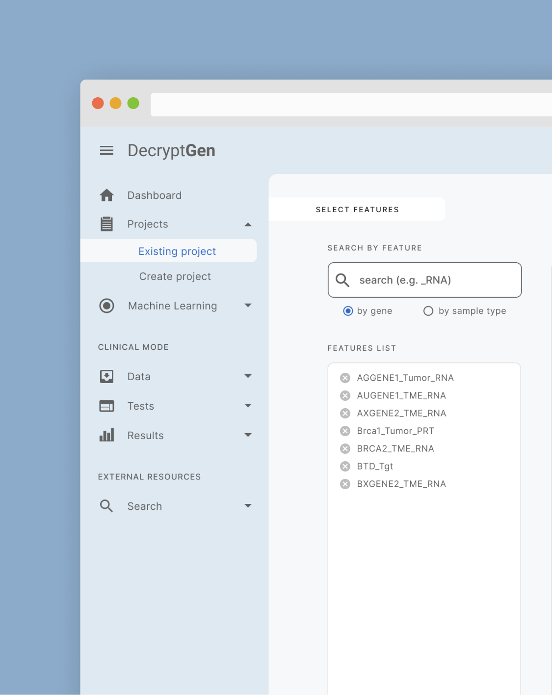
DecryptGen
- Year: 2021
- Role: UX Designer, Interaction Designer
- Tool: Figma
In this 40-hour collaborative project with two other UI/UX Designers, I assumed the lead on UX and interaction design. I contributed to UI design to help DecryptGen* make it easier for biomedical scientists to mine complex genome data.
*Due to a signed non-disclosure agreement, I have given the company a fictitious name and generalized proprietary information as much as possible.
Overview
Background
DecryptGen is a web-based, no-code, fully automated machine learning platform used by biomedical scientists at universities, research centers, or private industry sectors to mine insights, such as biomarkers, potential drug markers, and therapies for personalized medicine discovery, development, and implementation.
Project Goal and Solution
Since launching, DecryptGen has set out to make it easier for biomedical scientists to mine complex genome data and correlate the data with clinical information to find the best drug based on a patient’s genetic footprint. DecryptGen wanted to launch version 1.0 of its platform and needed design artifacts to get its design system launched and ready for developers.
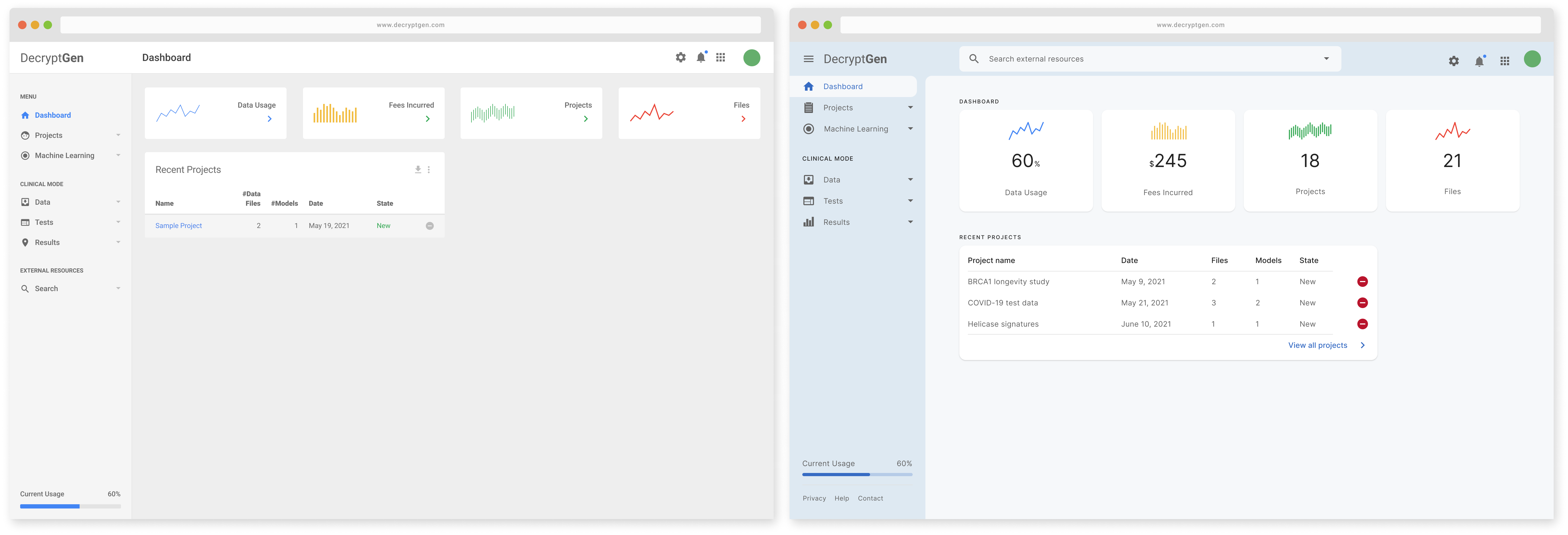
I collaborated with two other UI/UX Designers to provide a style guide, UI kit, and assessment of current screen designs. I provided UX and interaction design recommendations for an accessible and usable data analysis dashboard that makes it easier for biomedical scientists to mine complex data.
Research Methods
DecryptGen is a lean startup following an agile approach, so we used the Lean UX design process to make quick design decisions during the 40-hour time constraint. We created accessible and usable design artifacts to help DecryptGen get its design system launched and ready for developers.
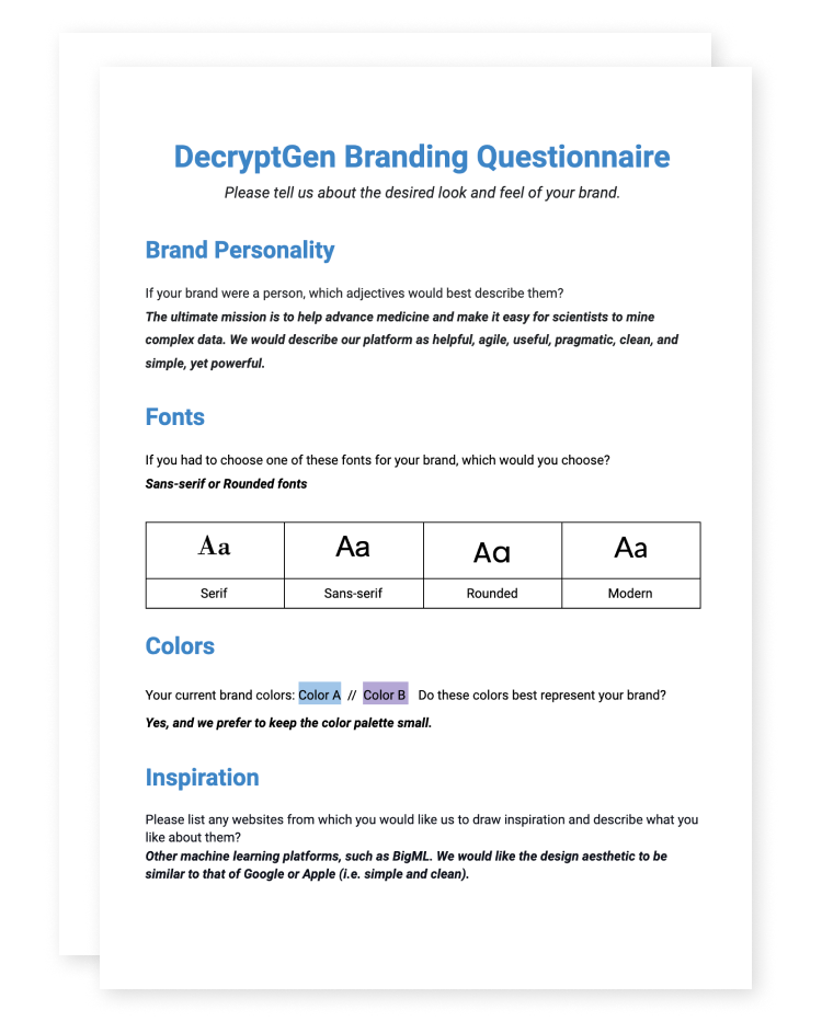
To better understand the desired brand personality and attributes, we created a branding questionnaire for DecryptGen’s founders to complete.
Design Inspiration
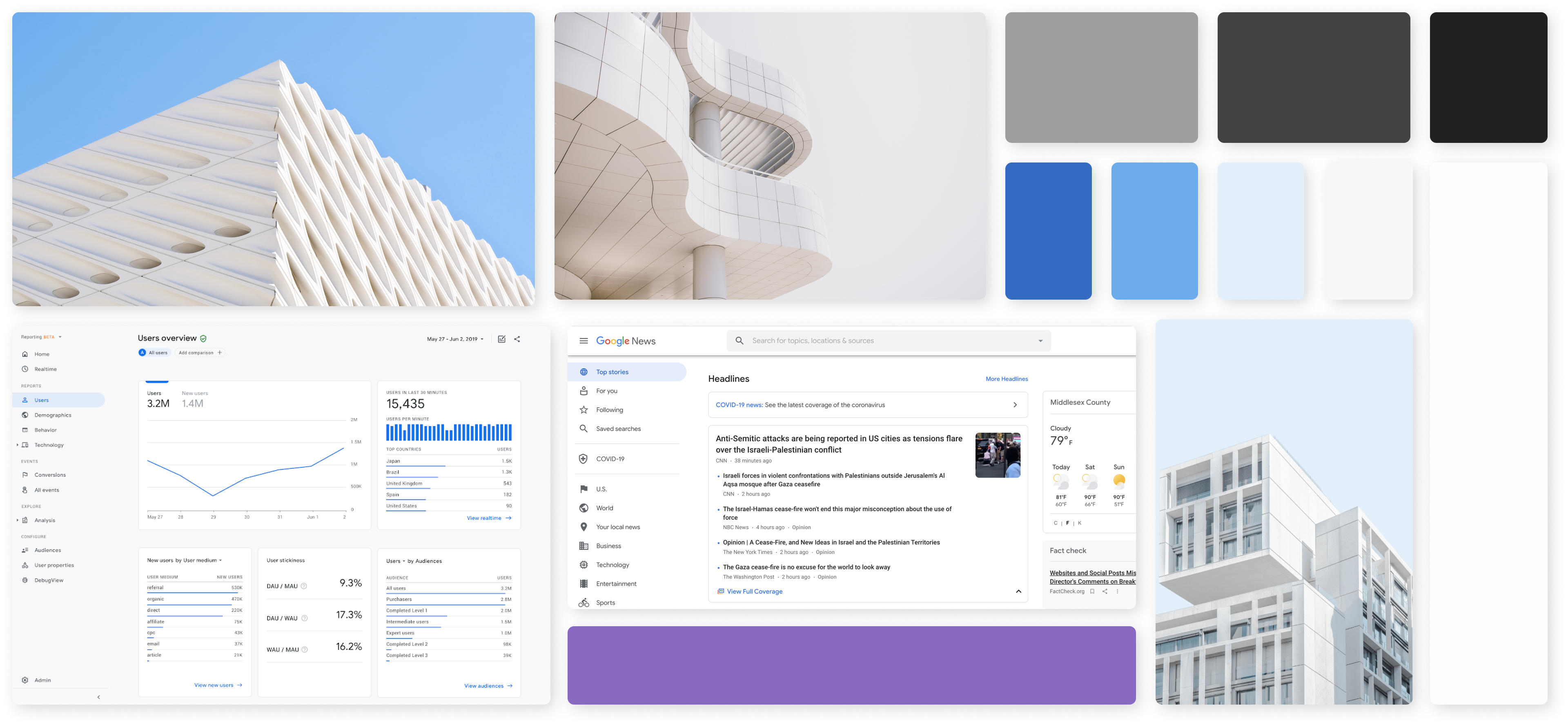
Based on the questionnaire, we designed a mood board and color palette. I considered architectural design imagery a metaphor for a data analysis dashboard because it conveys a clean, precise, and agile sensibility and depicts the ability to derive a clear and consistent design from intricate and elaborate elements.
Style Guide
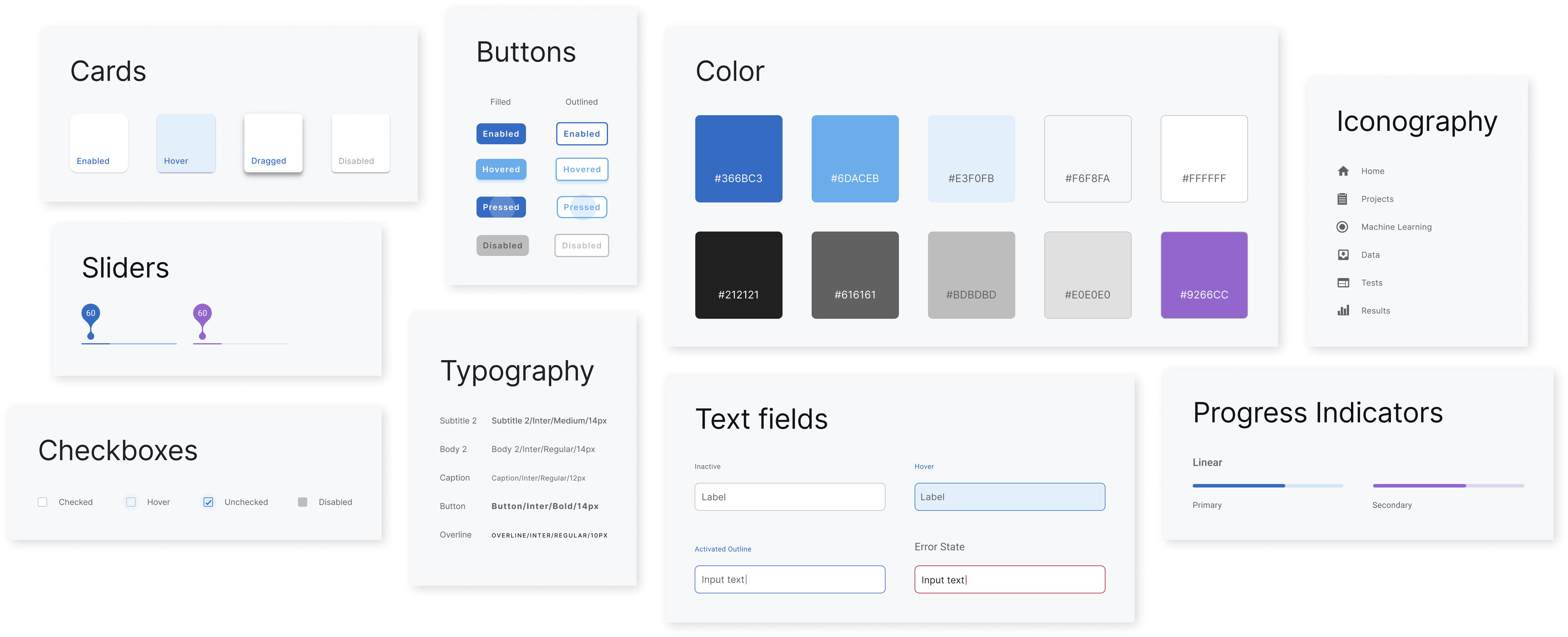
We created a style guide reflecting the brand’s pragmatic, useful, and agile personality to ensure uniform design elements throughout the platform.
Color
We selected blue as the company’s primary color because blue communicates trust and is widely used in the health and research industry.
I proposed using monochromatic variations of the primary color throughout the platform to communicate interaction states and visual hierarchy. Using one color throughout the platform allows the content to stand out.
Typography
Users would attribute any difficulty reading the selected typeface to the platform itself, so I recommended typeface options that would support the user’s primary goals while communicating the brand’s personality.
I proposed using a typeface with a tall x-height so the text would appear large enough to aid legibility at small font sizes and reduce eye strain while reading on a computer screen. I also proposed using monochromatic variations of the primary text color to communicate emphasis and informational hierarchy.
UI Components
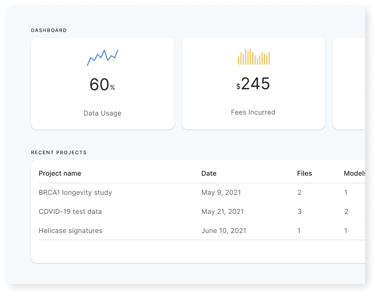
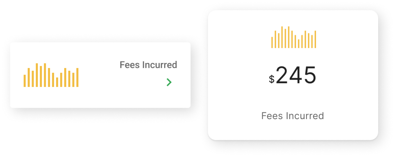
Adding a drop shadow to cards gives the impression of elevation, distinguishing the card from the background.
I proposed adding elevation to cards and using contoured edges to provide a more aesthetically pleasing design. I also suggested adding an informative element to top-level dashboard cards to help users view additional information at a glance.
Design Decisions
We made design decisions that would improve accessibility and help users reduce distractions while completing complex tasks.
Promote Acceptance
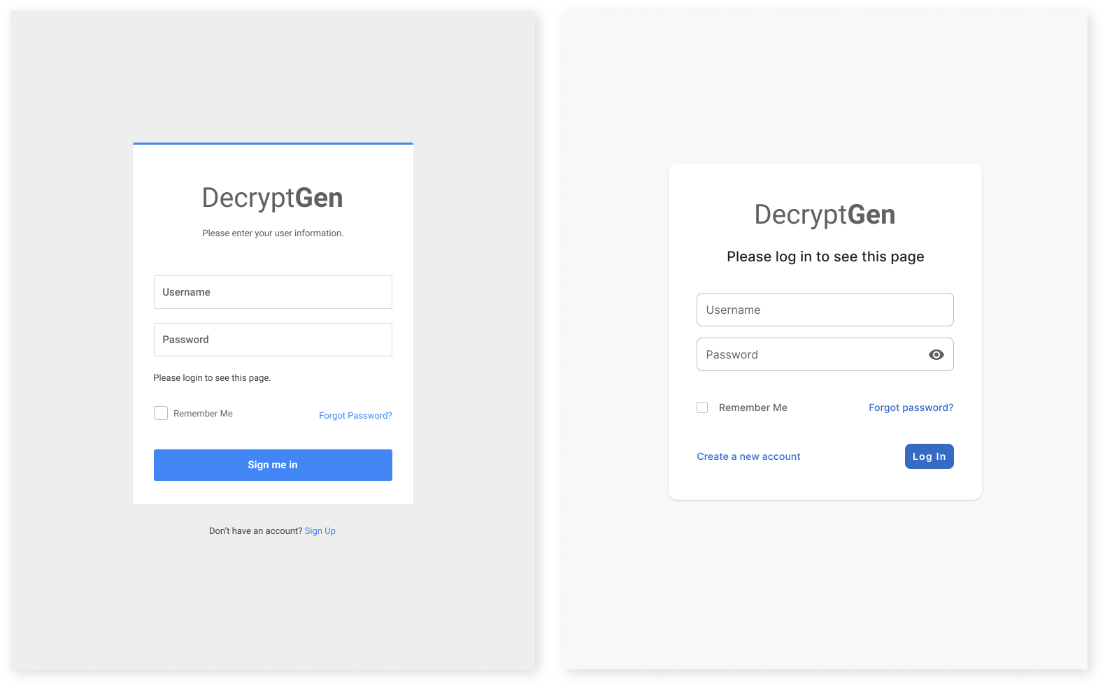
Aesthetically pleasing elements are perceived as easier to use and are more effective at promoting acceptance and satisfaction, so I wanted users to see an attractive design starting with the login screen.
Enhance Visual Design
I aligned the login form vertically and increased its width to one-third of the view width for an aesthetically pleasing composition. I also increased the border radius of the background container because people find contoured edges to be more visually appealing. I added a drop shadow to the card to give the impression of elevation, and I changed the background color to the lightest variation of your primary color.
Improve Accessibility
To improve accessibility, I increased the font size and changed the typeface to one that features a tall x-height. I also increased white space to reduce clutter and improve readability. Additionally, I used consistent wording in the description text and button and removed redundant text.
Match Between System & Real World
We selected icons that we felt were more representative of the task they indicated because people see cues that tell them what to do with an object.
Improve Discoverability
Moving the search field increases its visibility, makes it more likely to be used, and improves usability because users expect to find the search field at the top of the screen. I also added the Help & Documentation links to the footer of this left sidebar.
Reduce Distraction
I also recommended adding a drawer to increase workspace and help users filter distractions while working on complex tasks and moving the search field from the bottom of the left sidebar to the top navigation.
Improve Usability
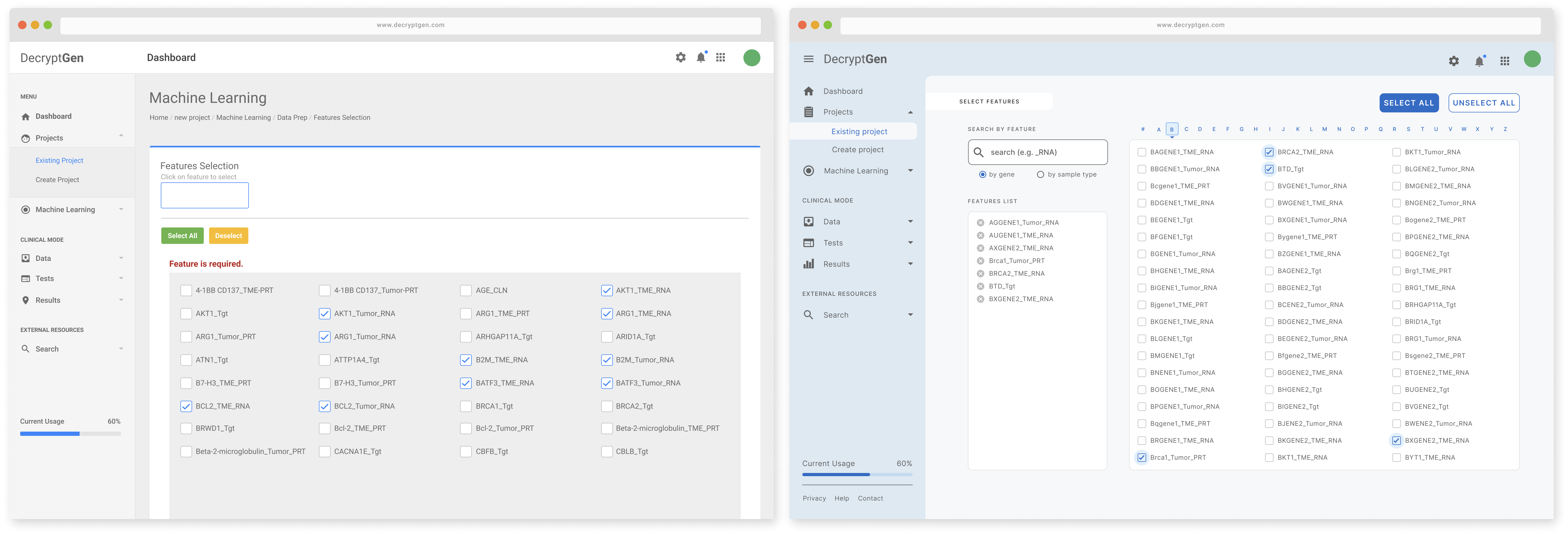
We alphabetized search features and created a summary box to make the Choose Features screen scannable and easier to use. We also changed button colors to improve accessibility, notably for those with color blindness or poor vision.
Key Takeaways
DecryptGen is a lean startup following an agile approach, so we used the Lean UX design process to make quick design decisions during the 40-hour time constraint. We produced design artifacts to help DecryptGen get its design system launched and ready for developers. Given more time, we could expand on the design system by adding to the collection of reusable components and assets or providing naming conventions and codified interactions.
We could also obtain qualitative data through usability testing to better understand the user’s thought process as they navigate the platform and ensure that the right problem is solved the right way. In the absence of qualitative data, we could assess quantitative data after launching the platform and then optimize the UI design accordingly.