FitClub
- Year: 2021
- Role: UX Researcher, UI/UX Designer
- Tools: Figma, Useberry
As the sole UX Designer and Researcher for this 90-hour project, I worked through the critical steps in the Lean UX process to redesign a health-tracking app into a social fitness-tracking experience.
Overview
Background
FitClub, a well-established company, launched a family and friends health tracking app three years ago. The app lets users within a family or group of friends track each other’s fitness goals and achievements. Currently, there is no messaging feature within the product. To gain the social rewards of praise and recognition from friends and family, users share their fitness achievements on social media platforms outside the FitClub app.
Project Goal and Solution
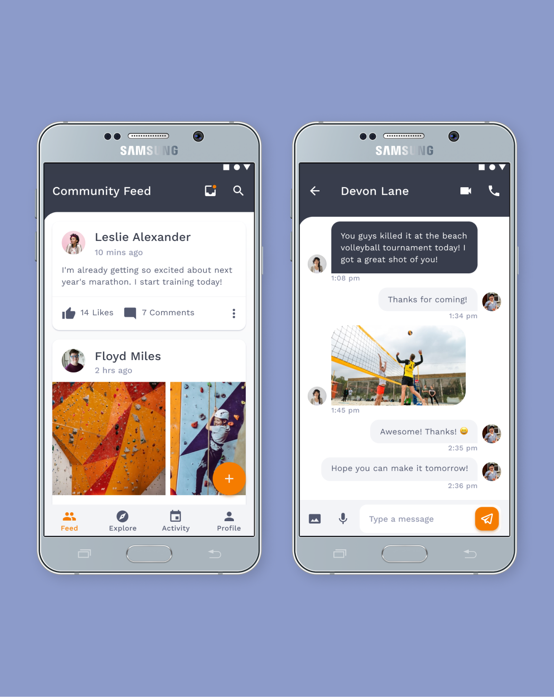
The design challenge was to design new messaging features that create sustained engagement. I redesigned the FitClub app to include integrated messaging features for a socially rewarding fitness tracking experience.
Research Methods
I used the following Lean UX design iterative cycle because I needed to make quick decisions and obtain design feedback as early as possible during the 90-hour project time constraint: Hypothesize, Design, Create an MVP, and Learn.
Hypothesize
Proto-Persona
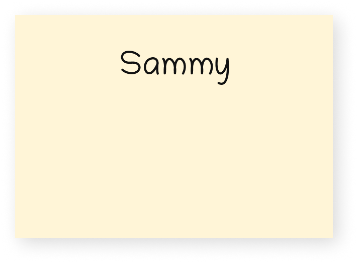
I created a proto-persona named Sammy to represent the company’s assumptions about the target user. Sammy is tech-savvy, budget-conscious, and uses a smartphone daily. Messaging and communicating with friends and family is an integral part of their daily life.
Lean UX Hypothesis
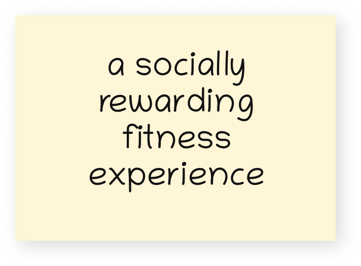
We will achieve a socially rewarding fitness experience if Sammy can receive motivation from friends and family with integrated messaging. We will know we are correct when we see user engagement and return usage metrics increase.
We will achieve…
if [proto-persona]…
can achieve…
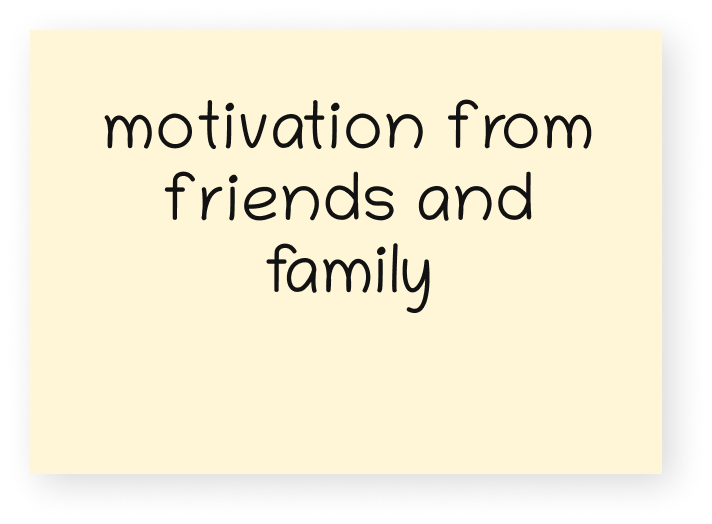
with this feature.
Design
Style Guide
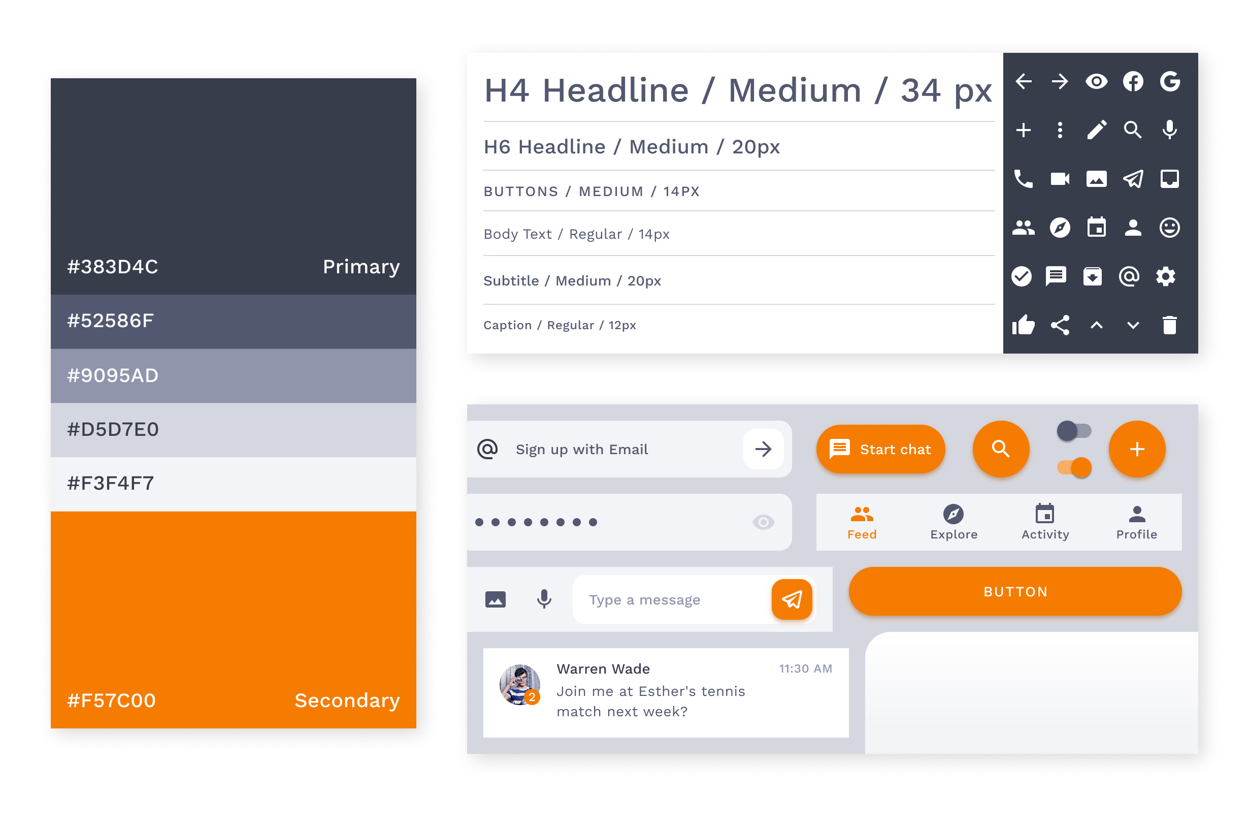
I created a lightweight brand platform and representative style guide to keep my designs consistent and ensure that my design decisions align with the brand’s personality and attributes. I wanted the product to feel contemporary, trustworthy, and motivating. Sammy would be more likely to see FitClub as an encouraging and reliable friend who always has Sammy’s best interests in mind.
Material Design
I designed for Android smartphones because the Android operating system currently dominates the global market. Researchers expect the gap between iOS and Android users to increase. I used Google’s Material Design colors, typography, icons, and components throughout the entire app.
Colors
The primary color is dark indigo, and the secondary color is orange-700. The vivid secondary color contrasts the monochromatic variations of indigo used for the backdrop and text.
Typography & Icons
FitClub uses Work Sans across the entire app, which allows the app’s imagery to stand out. FitClub uses Regular and Medium weights, which are optimized for on-screen text usage. FitClub uses a collection of 36 Material icons, which are simple, modern, readable, and designed on a 24px by 24px grid.
UI Components
FitClub uses monochromatic variations of the primary color to distinguish different UI elements. Floating action buttons and call-to-action buttons have a 50px border radius. All other components have a 12px border radius.
Create an MVP
To test my solution, I created a prototype realistic enough to get genuine reactions to the final product.
Top-Level Destinations
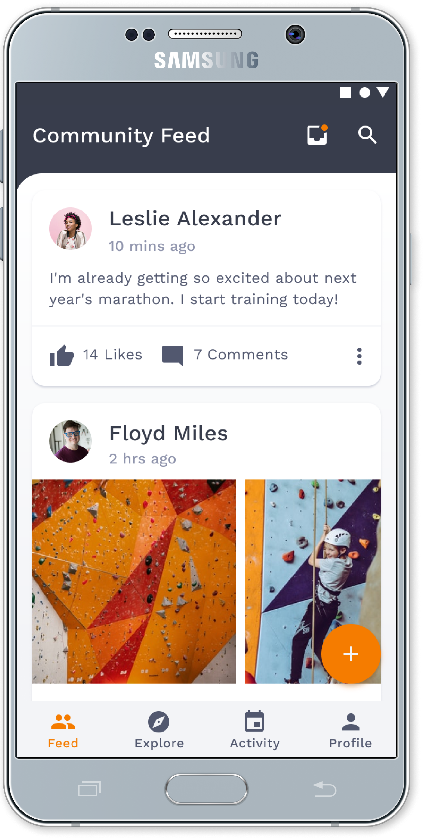
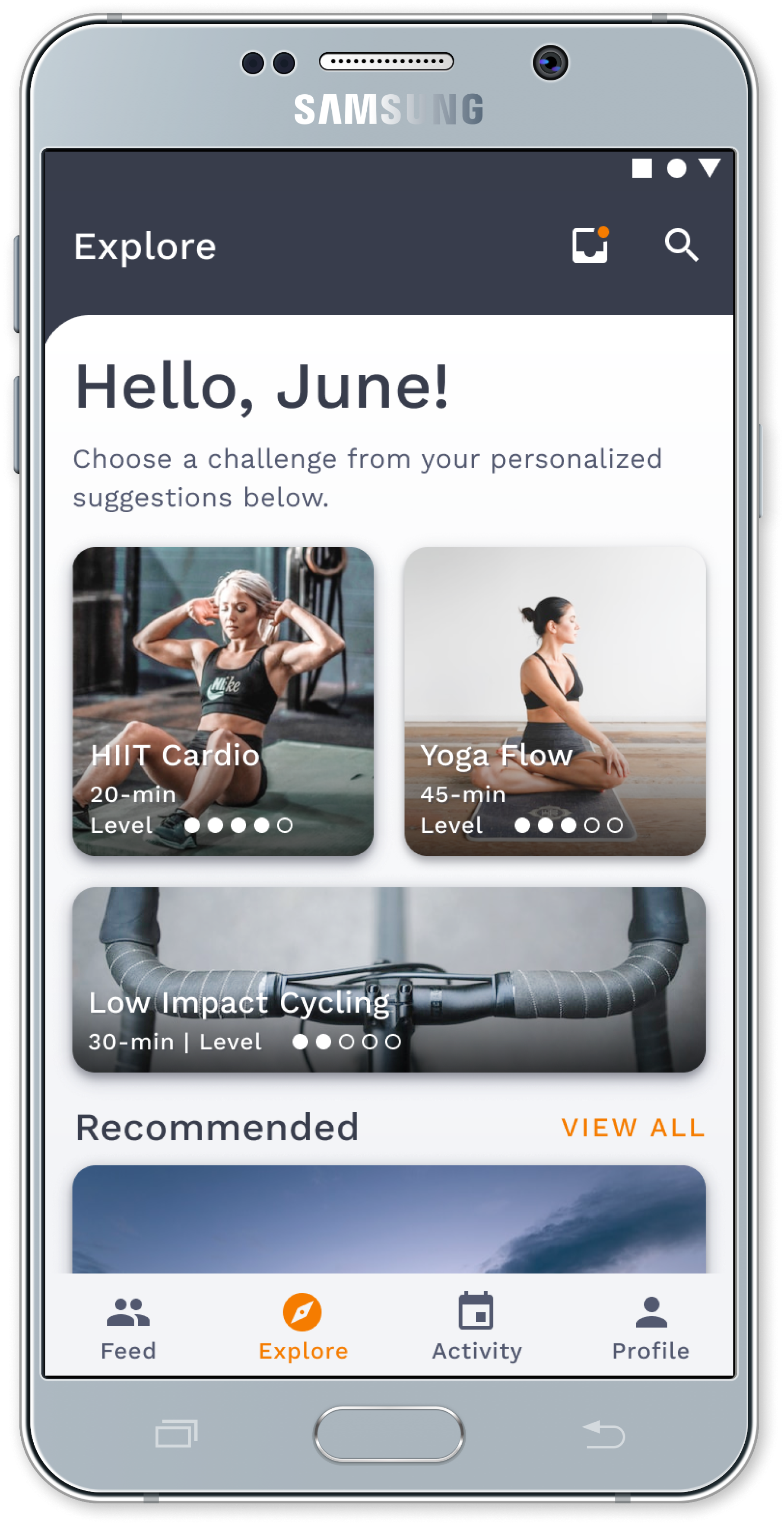
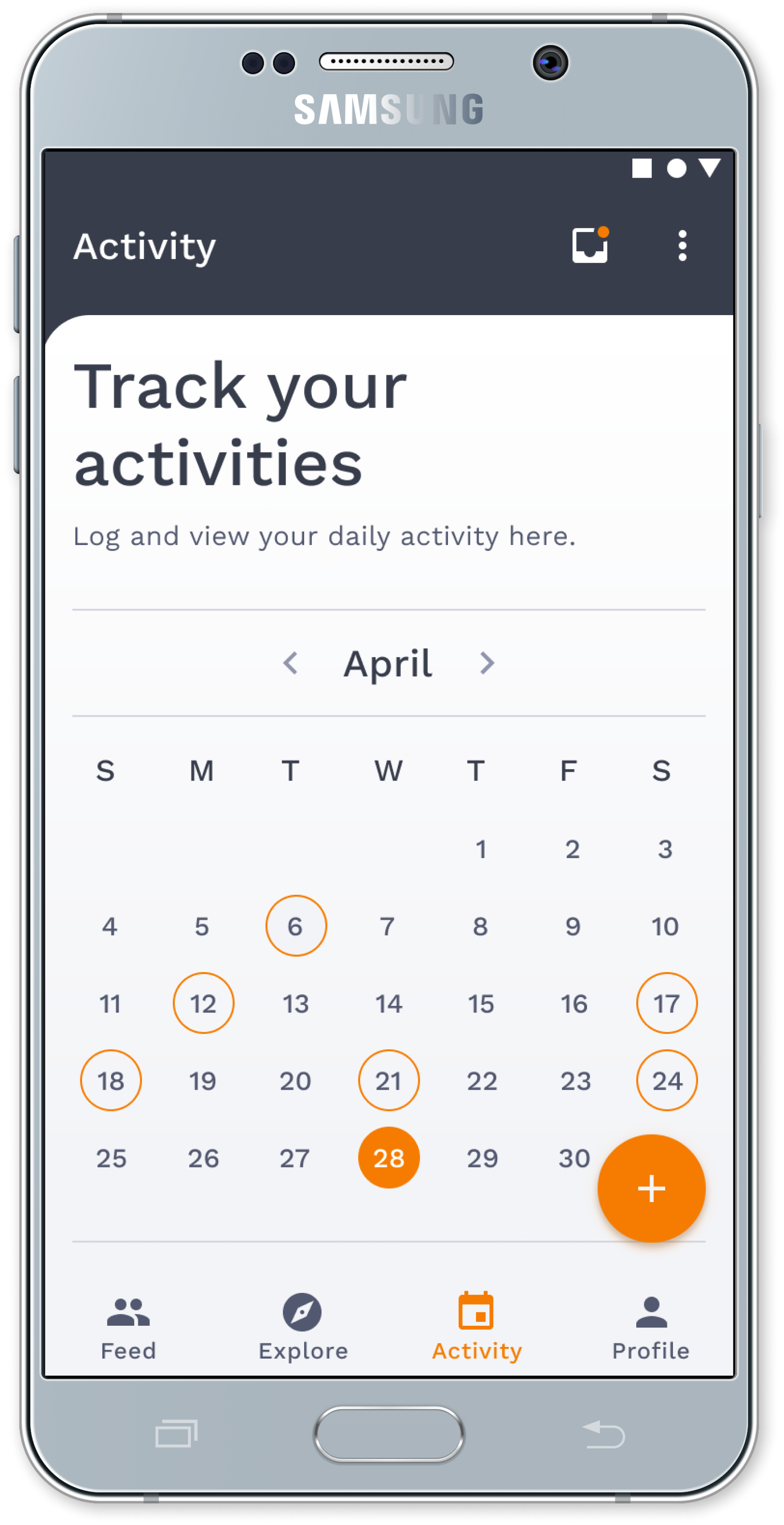
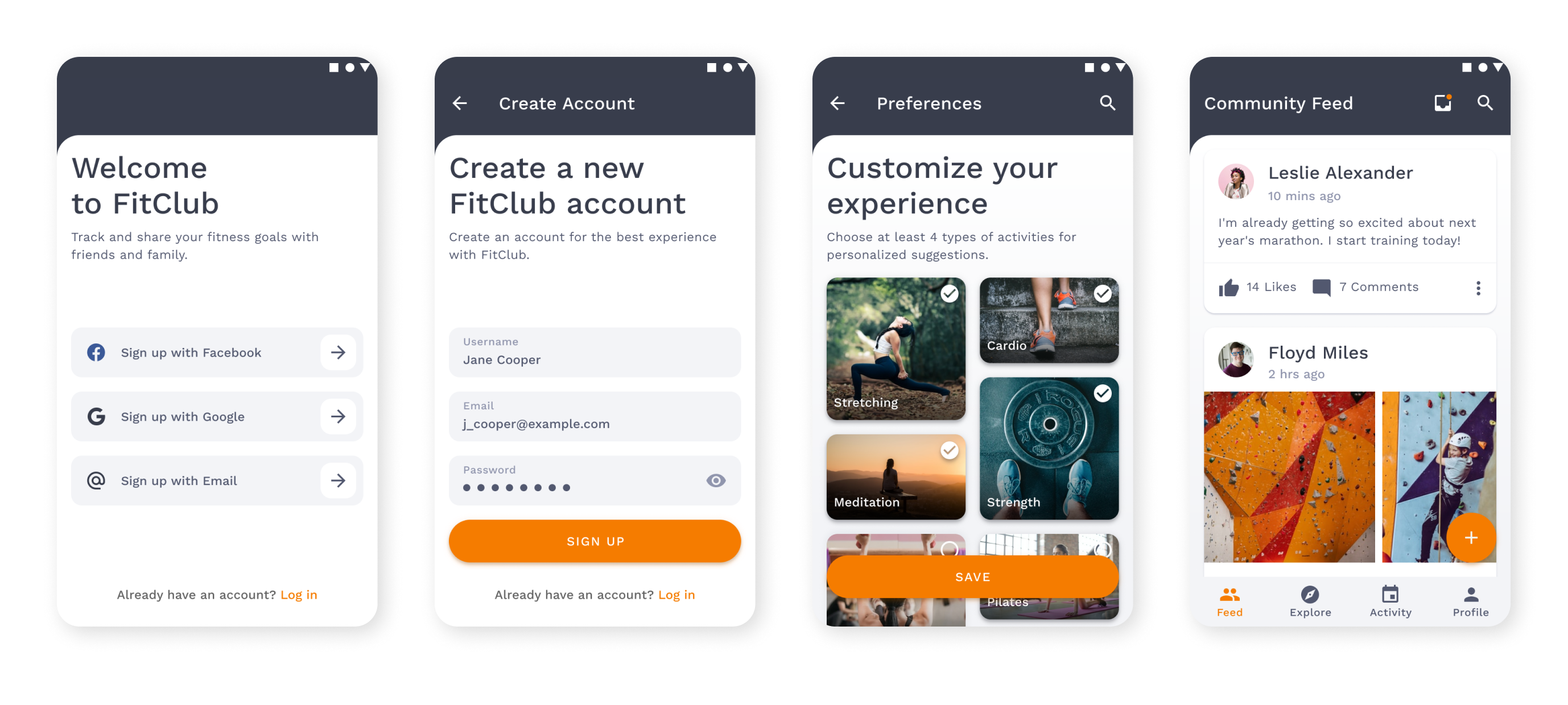
Connecting with the community regarding fitness goals and achievements is Sammy’s anticipated outcome when using FitClub, so the community activity feed is on the home screen. Each top-level destination provides an intrinsic reward for Sammy.
This screen heightens Sammy’s search for social rewards by allowing recognition for fitness achievements.
This screen provides infinite scrolling through a list of personalized fitness challenges.
This screen allows Sammy to track completed and upcoming challenges.
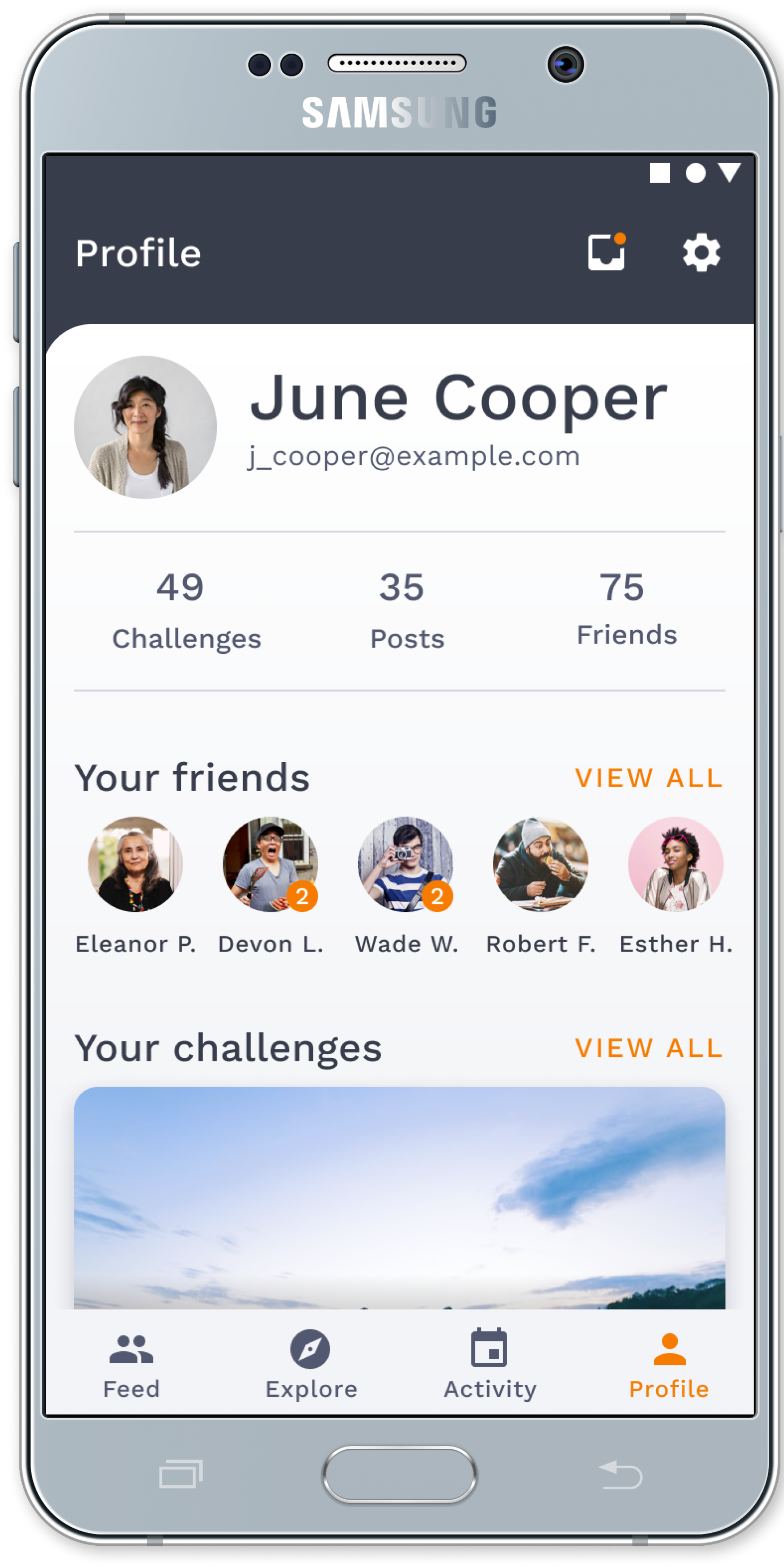
This screen displays Sammy’s collection of friends and completed achievements.
User Onboarding
Sammy will create an account and select her favorite type of activity to get personalized ideas during onboarding. Reducing the number of steps and time barriers between Sammy and her goal makes her intended behavior more likely. Account personalization is an integral feature of the FitClub experience, so it is a required onboarding step. The more Sammy personalizes the app, the more the app improves and the more valuable it becomes.
Key Takeaways
To assess behavioral key performance indicators (KPIs), I looked at the following metrics: overall average time-on-task, task completion success rate, and modification impact.
KPI Metrics
- Total time-on-task: 3 minutes and 11 seconds
- Task completion success rate: 100%
- Observation: Tasks 2 (Send a direct message) and 4 (Find completed challenges) took the longest to complete
Modification Impact
Redesigning the Profile screen and bottom navigation bar resulted in a 55.3% decrease in the overall completion time for tasks 2 and 4.
Indirect Observations
Without direct observation, I missed an opportunity to hear and understand the user’s thought processes as they navigated the FitClub app. However, click maps and user flows revealed that test participants expected to access their messages (Task 2) and challenges (Task 4) from the Profile screen, so I redesigned the UI accordingly.
Retrospective
Limitations
Time Constraints & Sample Size
The sample size of five participants in a usability study is sufficient to identify most usability problems. However, continued usability testing beyond the designated 90-hour project time constraint would yield a larger sample size and, as a result, produce stable heatmap and user flow results and more robust modification impact and system usability results. Given more time, I would have assessed attitudinal UX KPIs using system usability scores, customer satisfaction scores, and net promoter scores after each usability testing round.
Indirect Observation Alone
Conducting an unmoderated usability study in a scripted, lab-based environment through indirect observation provided both qualitative and quantitative behavioral data.
- Strength: This approach quickly identified problems with the most significant impact.
- Weakness: Without direct observation, I missed an opportunity to hear and understand the user’s thought process as they navigated the product.
Given more time, I would obtain qualitative data through direct observation using moderated usability testing.
Future Directions
Monitor App Performance
Continuously monitoring analytics with behavioral and attitudinal performance indicators could help improve user experience and achieve business goals.
Use Reminders & Notifications
Using notifications and reminders could increase engagement and ease of use. Sammy could choose to receive notifications on weekdays when her activities might be tedious and routine or when someone from her community sets a goal, shares an achievement, or sends her a direct message.