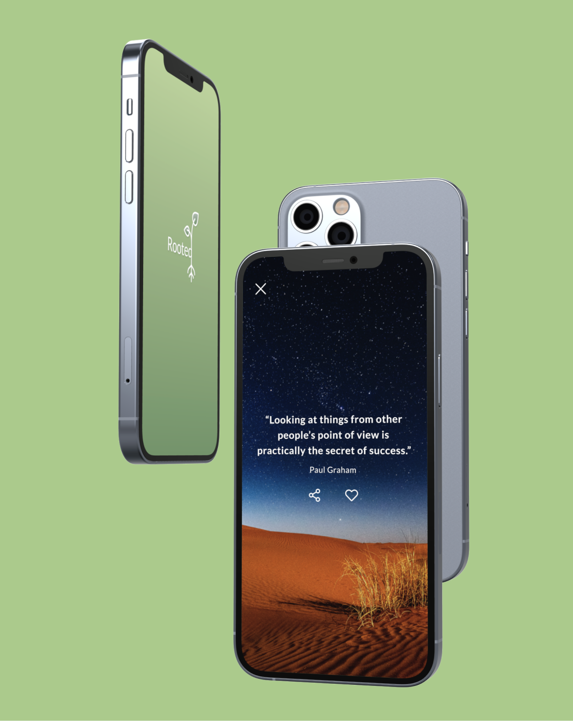
Rooted
- Year: 2020
- Role: UX Researcher, UI/UX Designer
- Tools: Sketch, InVision, Marvel
As the sole UX Designer and Researcher for this project, I worked through the critical steps in the UX research and design process to create a minimum-viable product to help people manage anxiety and depression.
Overview
Background
Prescriptions for anxiety, depression, and insomnia medications dramatically increased when COVID-19 was declared a pandemic in March 2020. The sudden, increased use of medications to treat depression, anxiety, and sleep disorders demonstrates the significant impact COVID-19 may be having on America’s mental health.
Project Goal and Solution
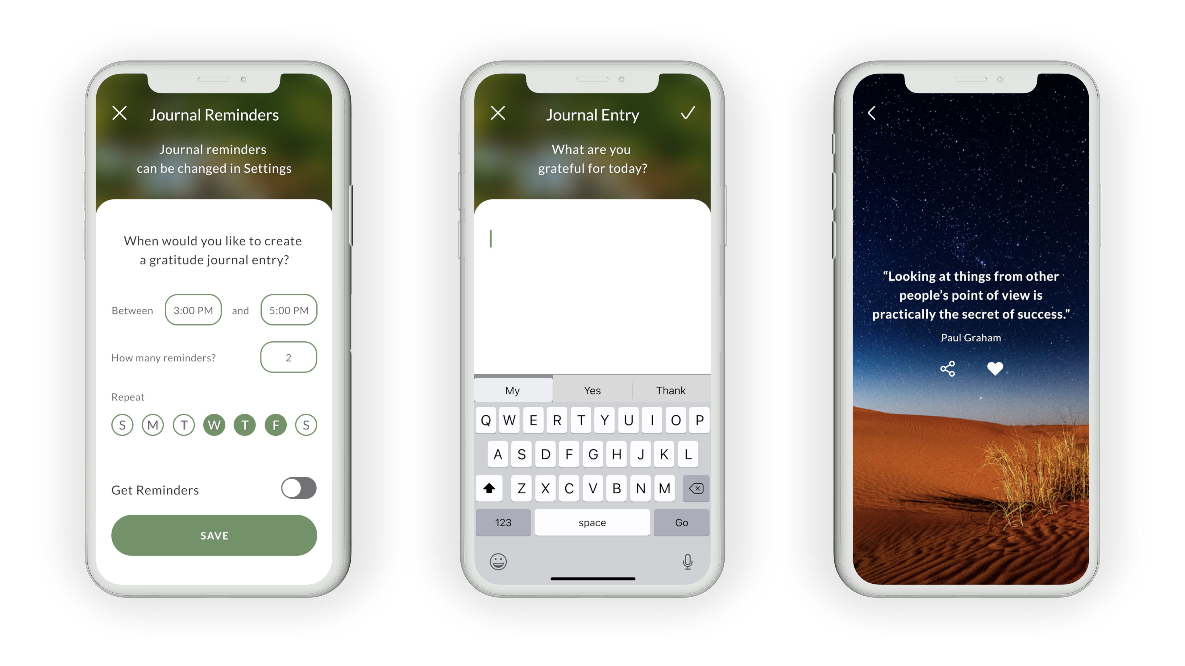
My design challenge was to design a minimum viable product to help people manage anxiety and depression. So, I designed a gratitude journal and daily motivational quote iOS mobile app that lets people like and share favorite motivational quotes, create and track journal entries, and set reminders to receive motivational quotes when they need them most.
Research Methods
To ensure creative problem-solving based on user-centered motivations, I used the Discovery, Design, and Validate Framework, which describes the broad phases of the design process.
Discover
Secondary Research
Secondary research revealed that positive psychology, mindfulness-based stress reduction, and habitual gratitude could effectively reduce anxiety and depression, so I chose to incorporate these features into the final product.
Competitive Research
I conducted a usability heuristic evaluation on three mindfulness apps using Jakob Nielsen’s Usability Heuristics and Severity Rating for Usability Problems so that I could identify and avoid similar usability problems in my own UI design. I looked specifically at User Control & Freedom, Aesthetic & Minimalist Design, and Help & Documentation because I felt these heuristics would be most relevant for a positive affirmation app.
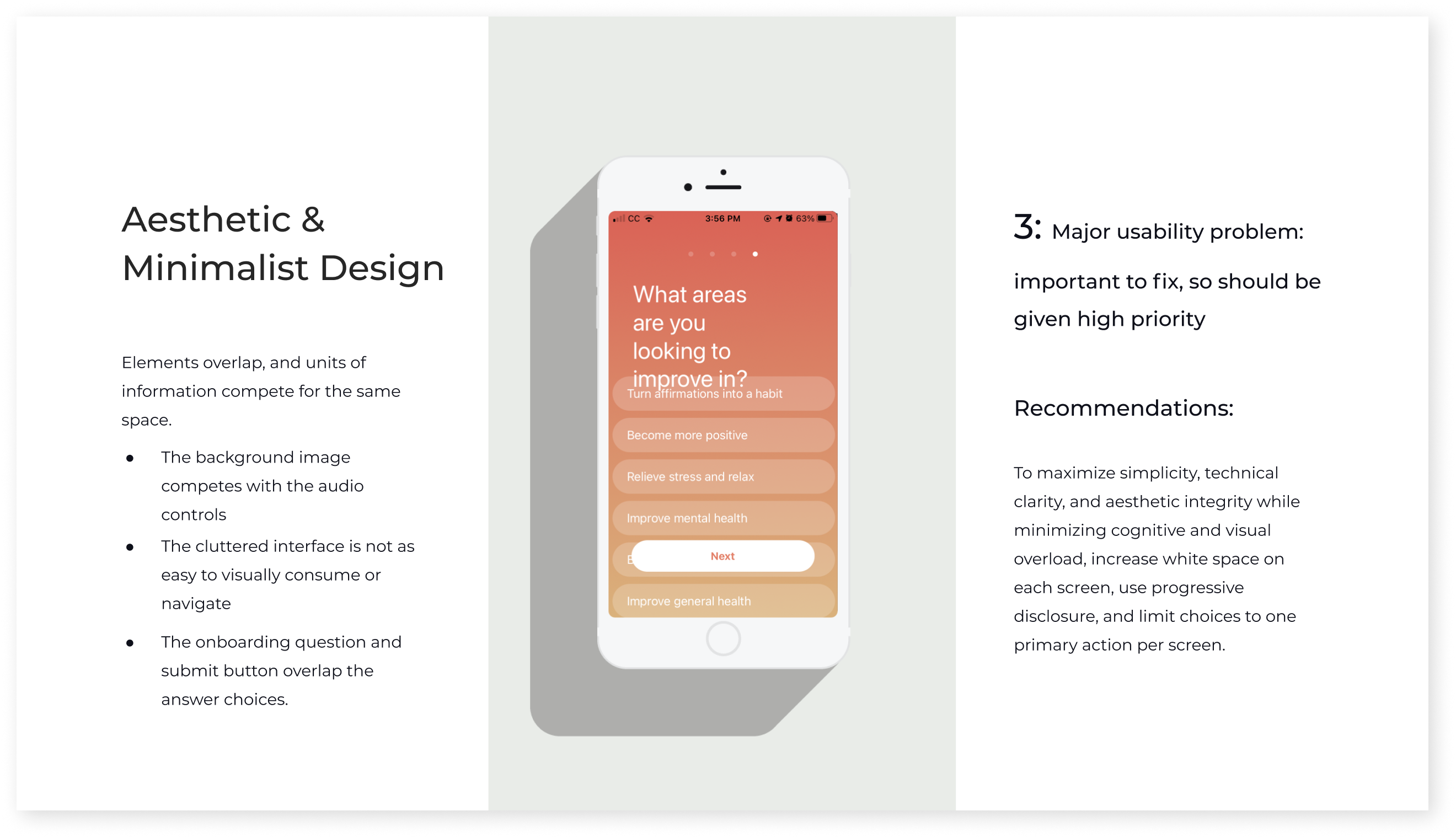
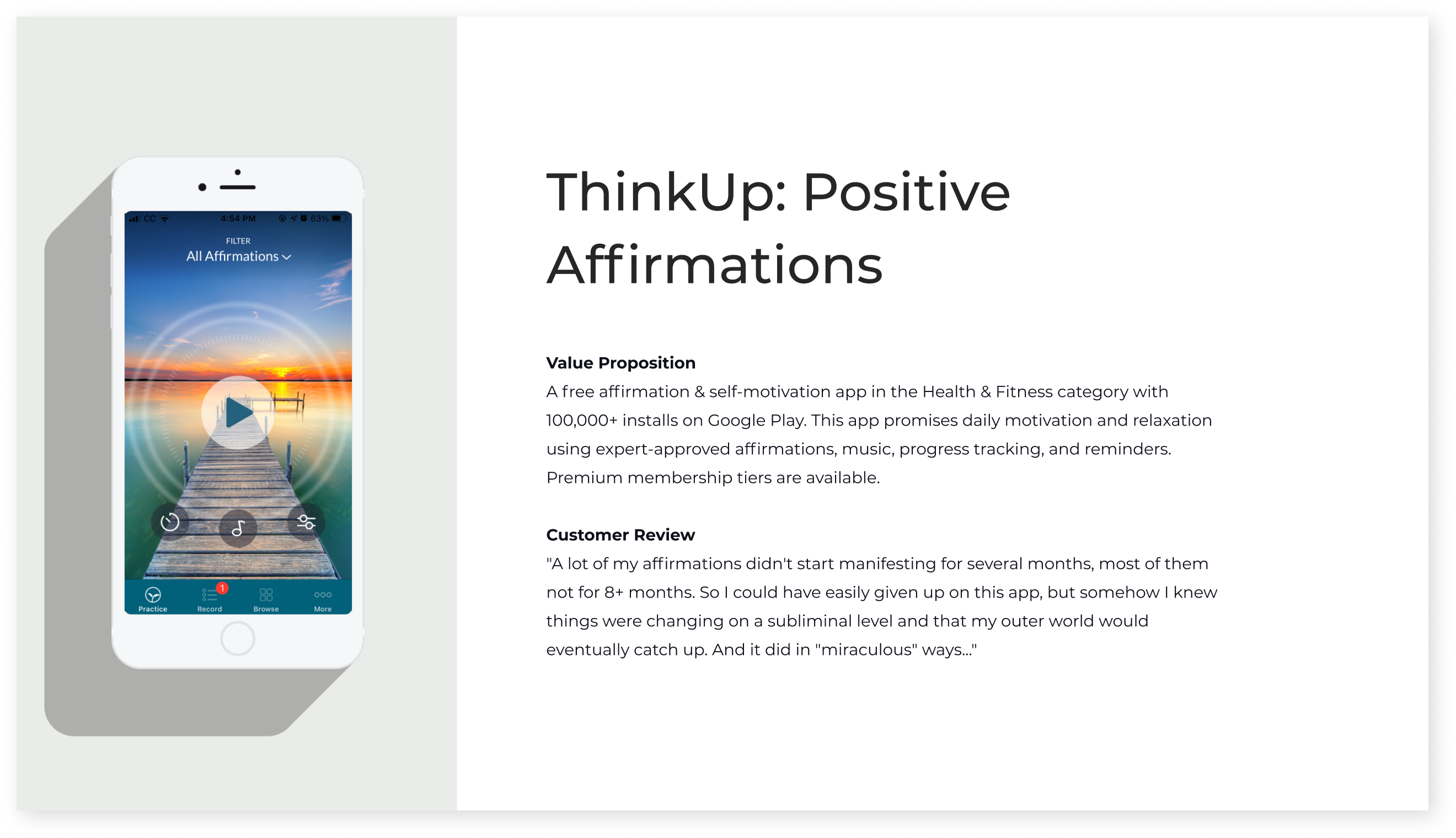
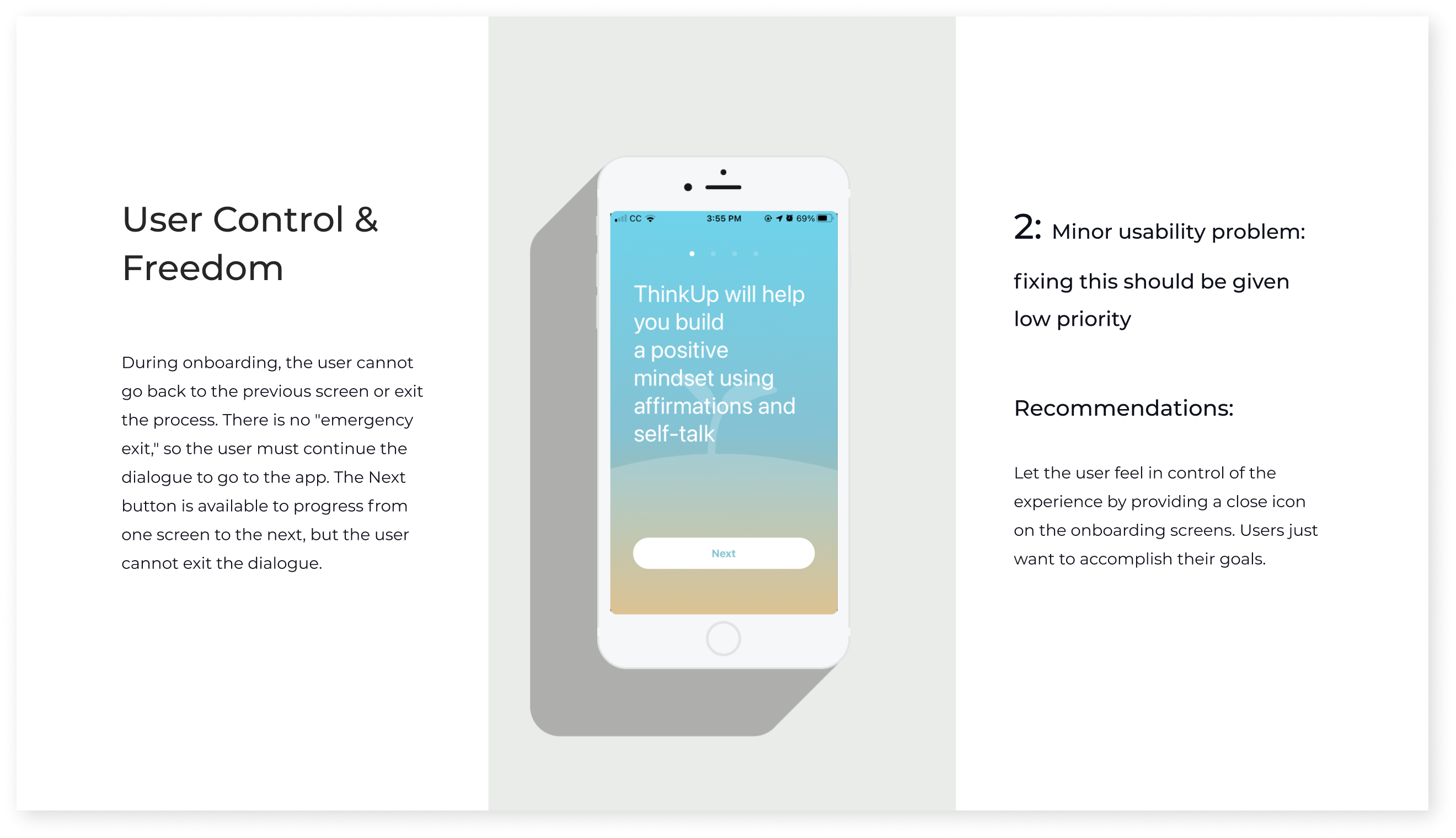
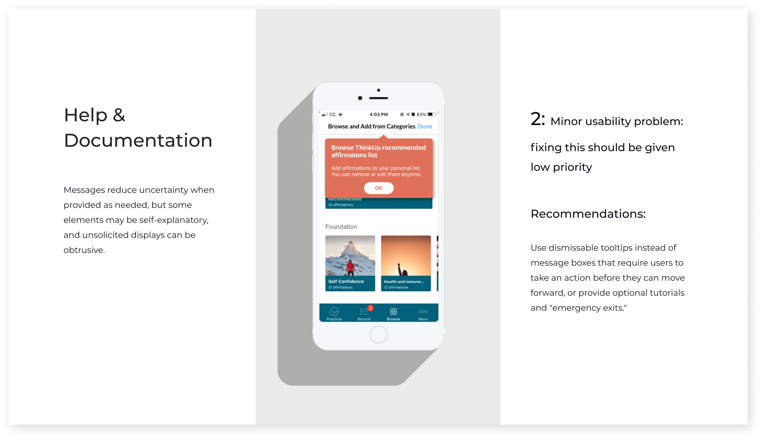
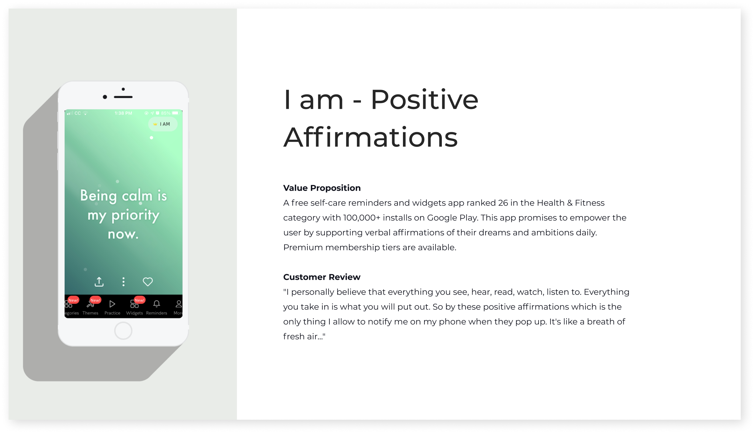
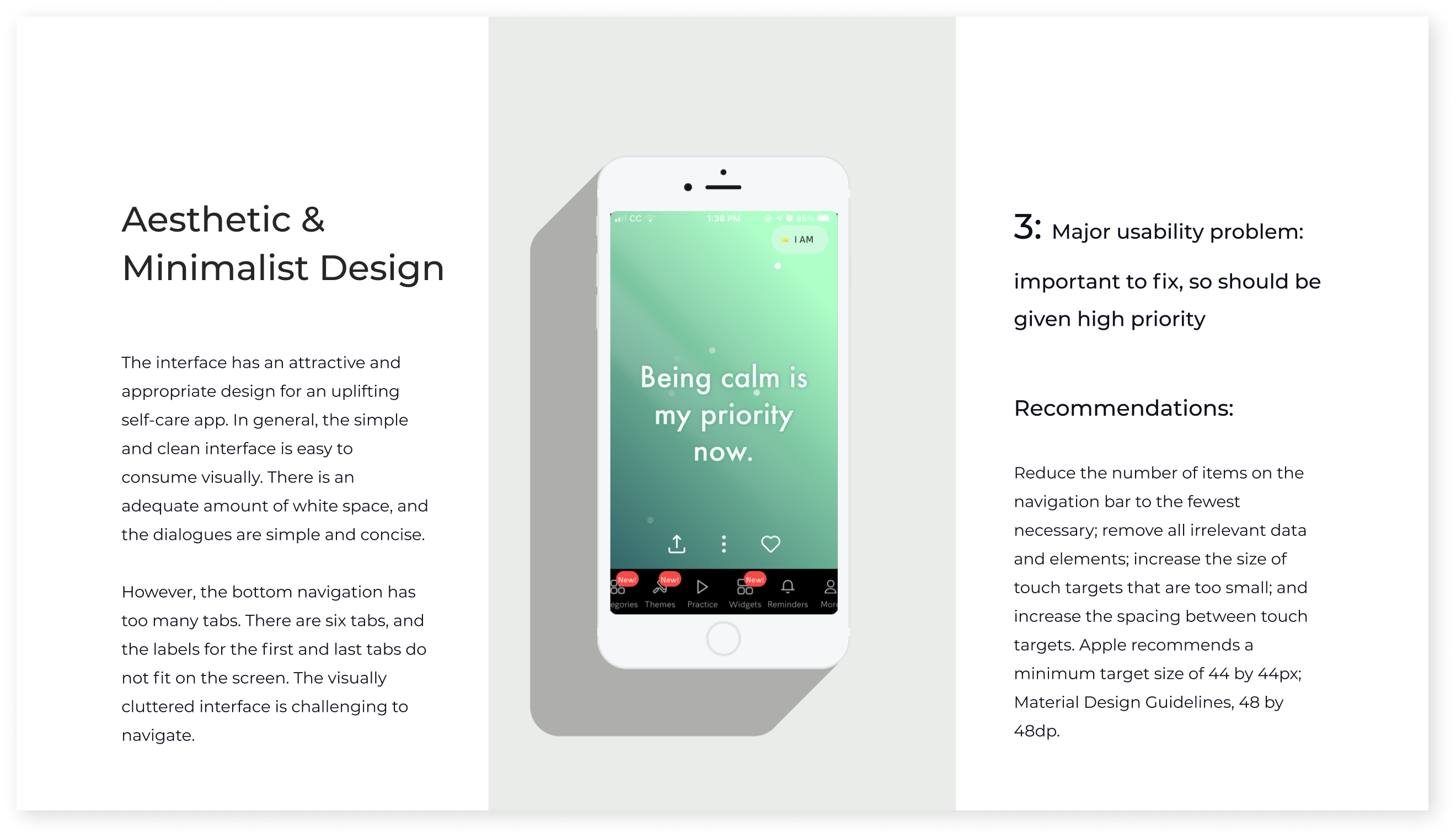
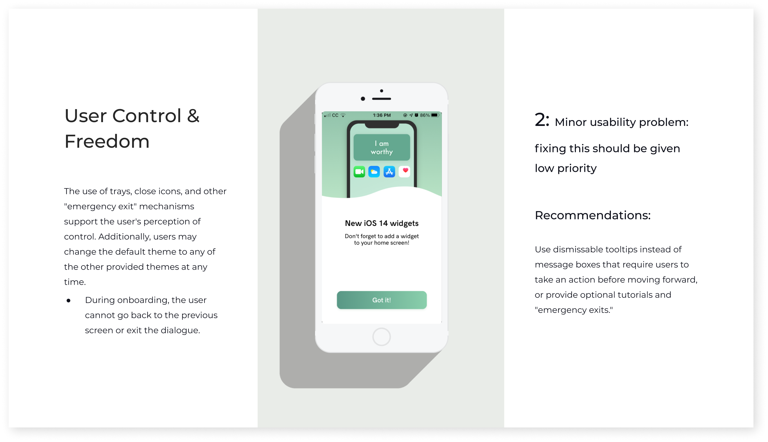
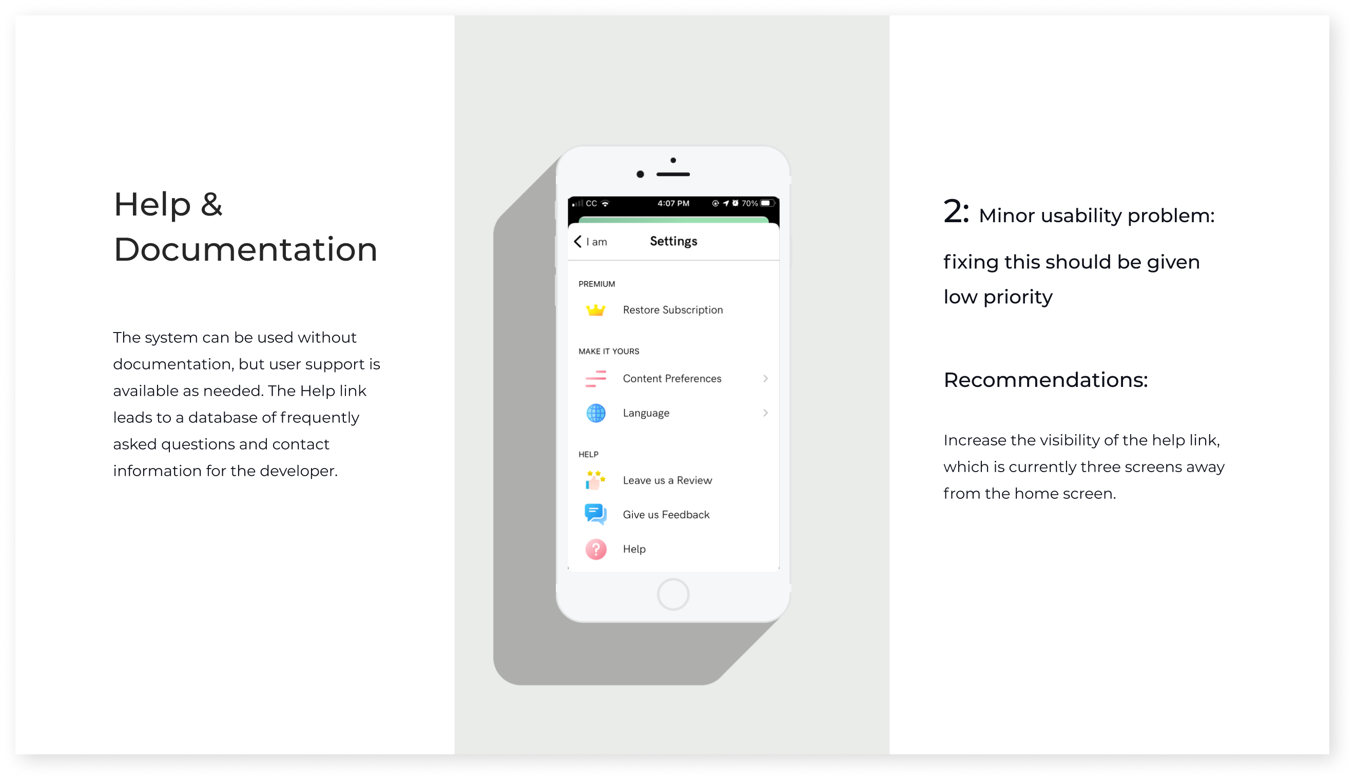
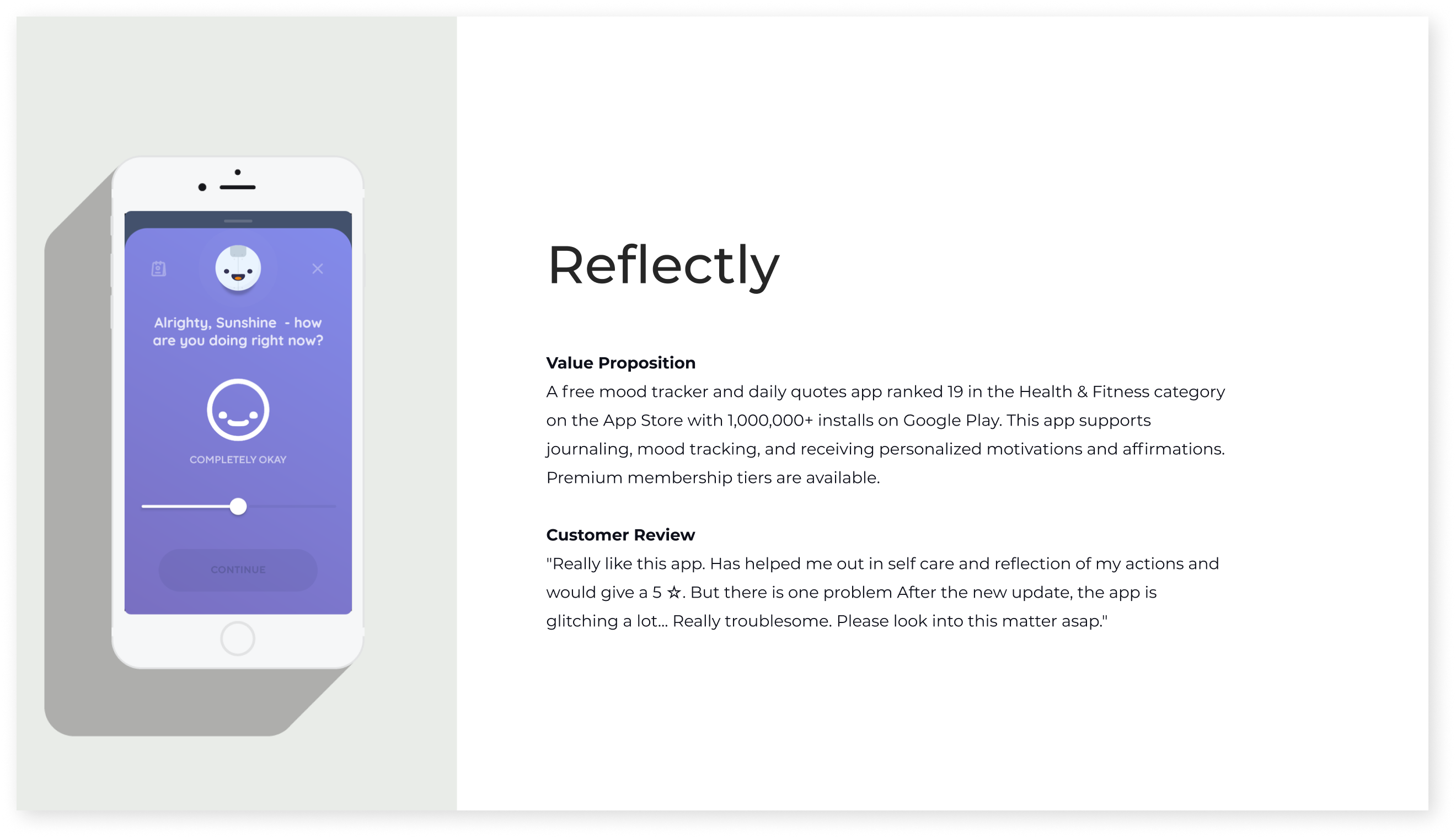
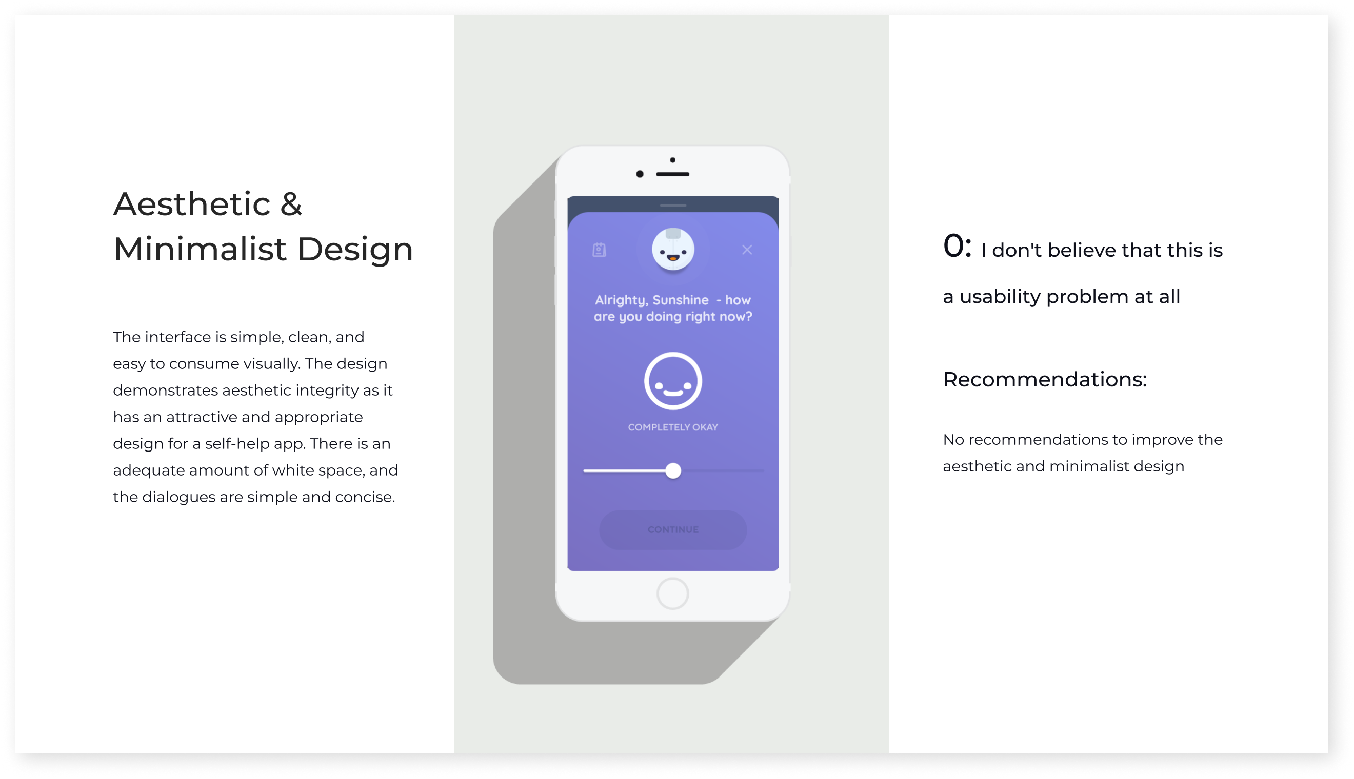
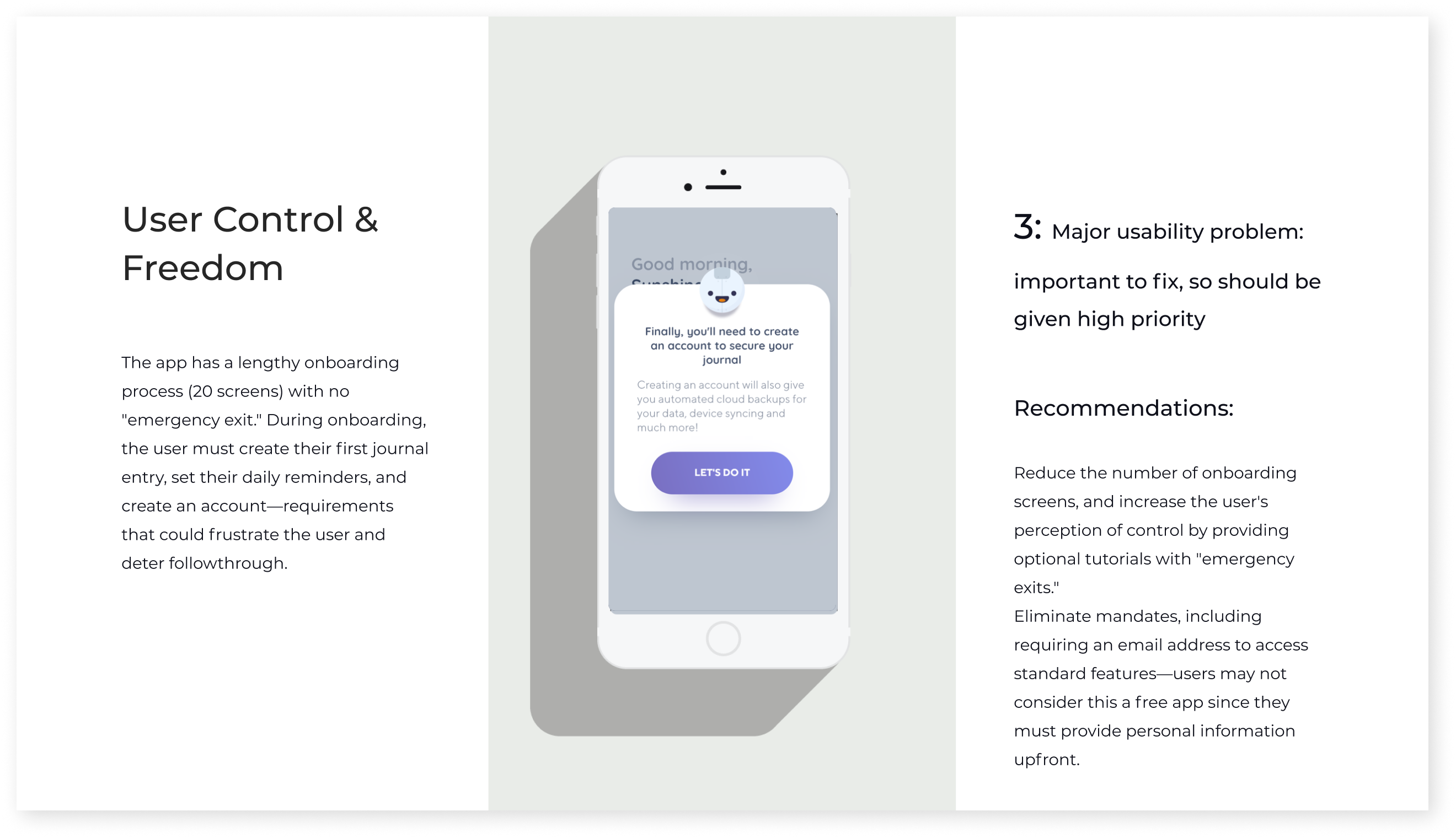
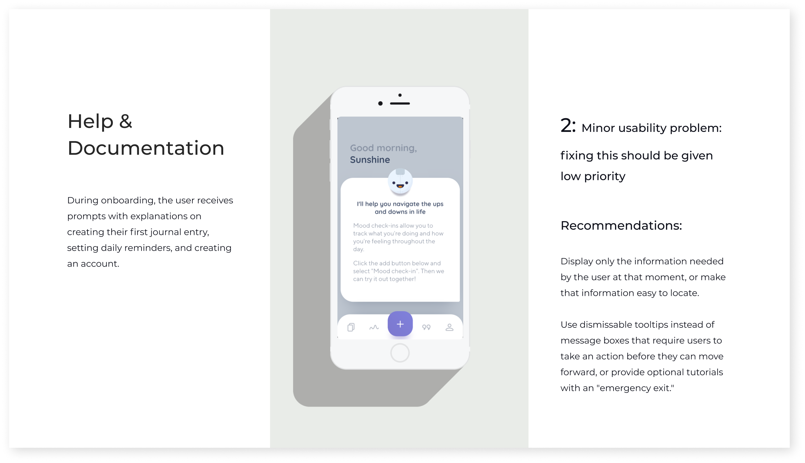
Heuristic evaluation of competitors
Screening Survey
I conducted a screening survey to explore how and why respondents practice mindfulness and to qualify respondents for interviews. I learned that my respondents used journaling, yoga, and meditation to reduce stress and anxiety, improve sleep, practice gratitude, and feel happier. Journaling was the most commonly used mindfulness practice, so I decided to create a journaling app.
User Interviews
I selected the first five screening survey respondents who reported that mindfulness was important in their lives—they would represent my target population. Then, I conducted open-ended interviews to assess their pain points, goals, feelings, thoughts, and behaviors toward mindfulness. Due to COVID-19 restrictions, I conducted all interviews via Zoom.
Research Synthesis
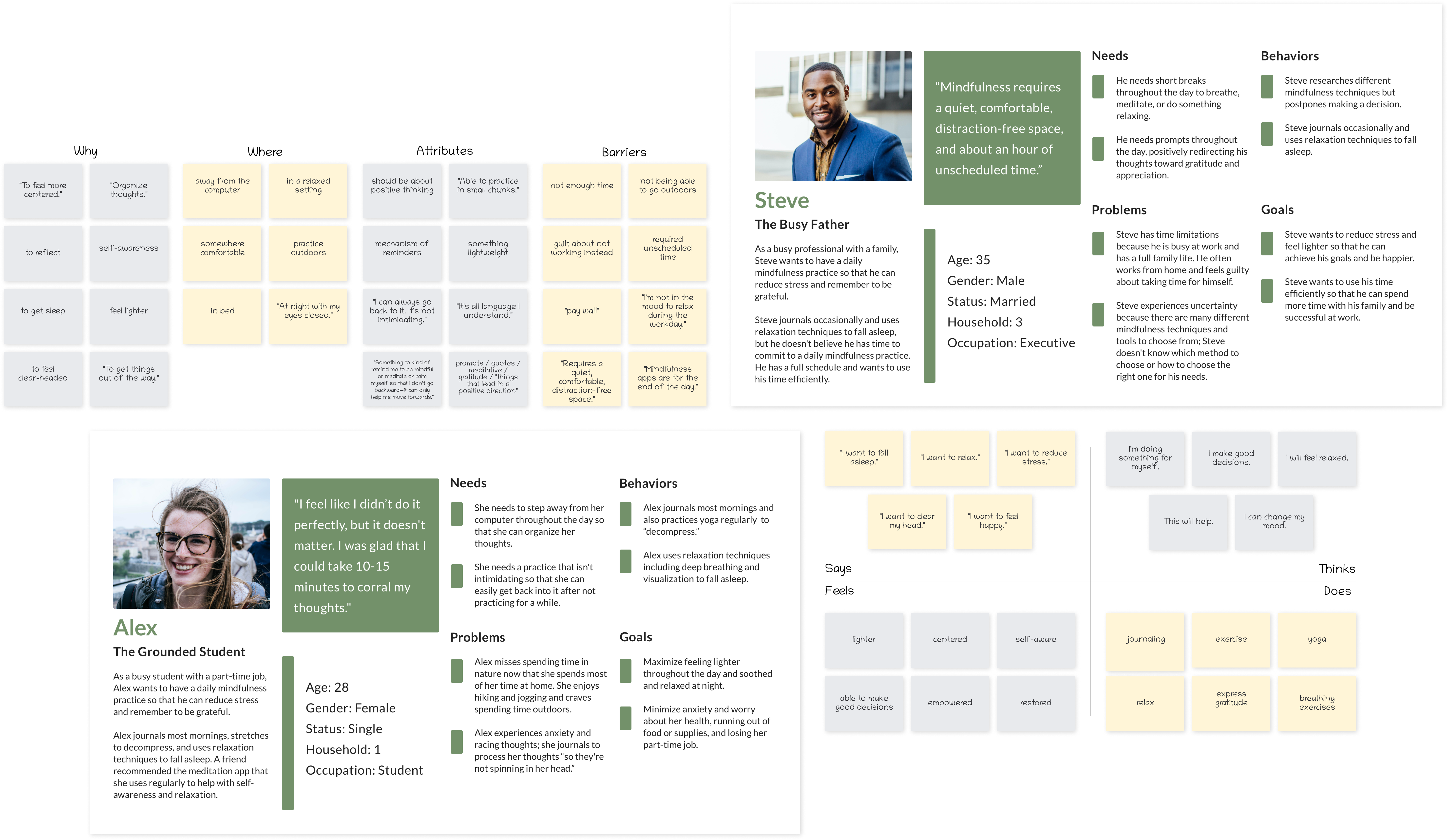
I generated an affinity map, empathy maps, and user personas to synthesize collected data, find patterns, and look beyond apparent insights gathered from interviews.
Personas
Interviews revealed two distinct types of target users: those who had a daily mindfulness practice and those who believed that having a daily mindfulness practice was unattainable. I named them Alex and Steve.
I feel like I didn’t do it perfectly, but it doesn’t matter. I was glad that I could take 10-15 minutes to corral my thoughts.
Alex
- Alex craves time outdoors and journals to process her thoughts” so they’re not spinning in [her] head.”
- Alex wants to reduce anxiety and worry so that she will feel lighter throughout the day and relaxed at night.
“Mindfulness requires a quiet, comfortable, distraction-free space, and about an hour of unscheduled time.”
steve
- Steve has time limitations due to work and family life, and he feels guilty about taking time for himself.
- Steve wants to use his time efficiently so that he can spend more time with his family and be successful at work.
How Might We Questions & User Stories
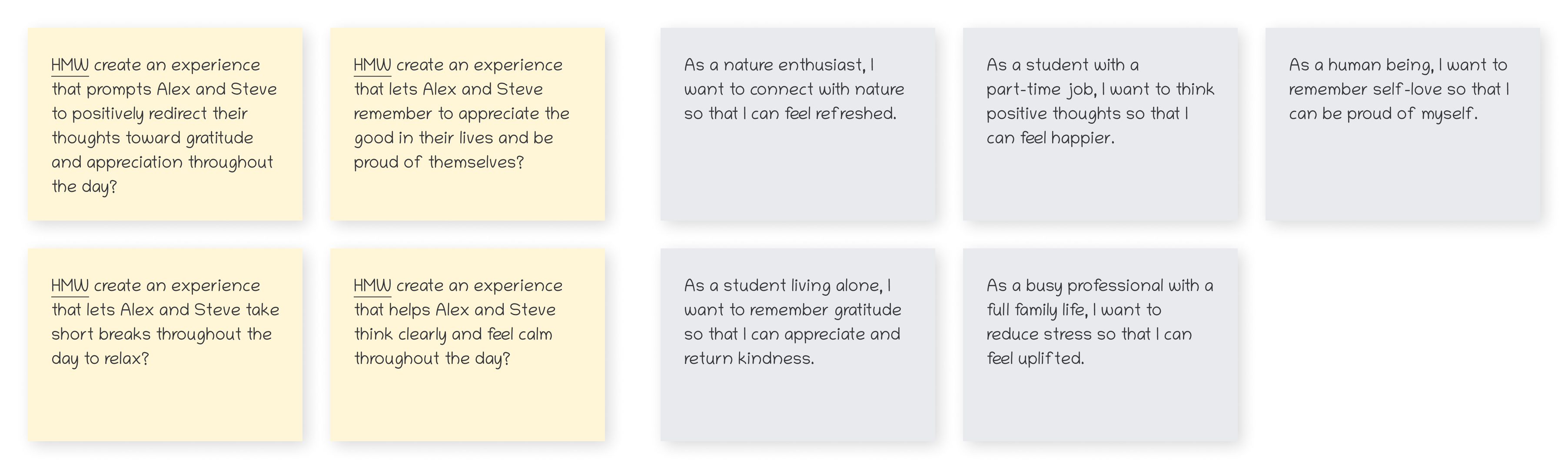
I generated four How Might We (HMW) questions to define and articulate the problems that needed an innovative solution. Next, I created user stories based on each persona’s needs, behaviors, goals, and frustrations. User stories enabled me to empathize with Alex and Steve and generate ideas that fit into their lives.
Design
During the Design phase, I made design decisions and visualized a solution based on insight gained during the Discovery phase.
Information Architecture and Wireframes
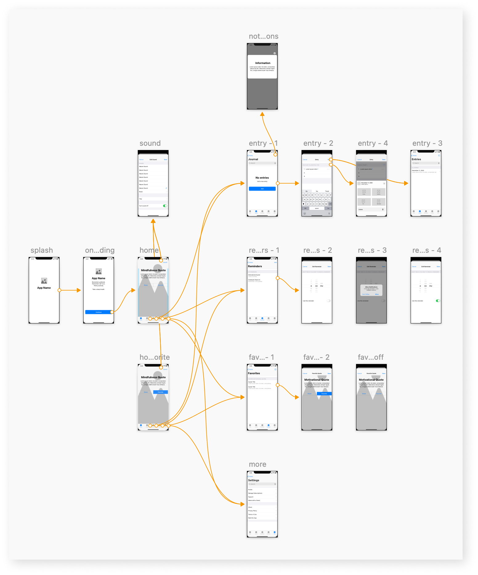
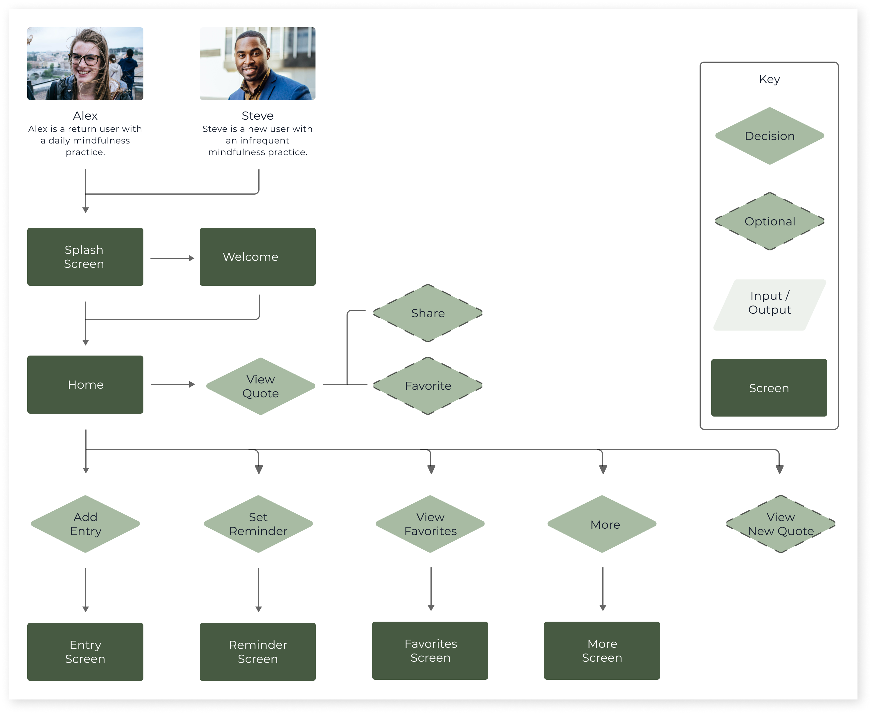
I created a sitemap and user flows to help keep track of how Alex and Steve will move throughout the app. I created a low-fidelity digital version of my sketches to identify critical design decisions that I would need to make. Then, I conducted guerilla usability testing using this digitized version of my sketches to inform future design decisions.
Moodboard and Sketches
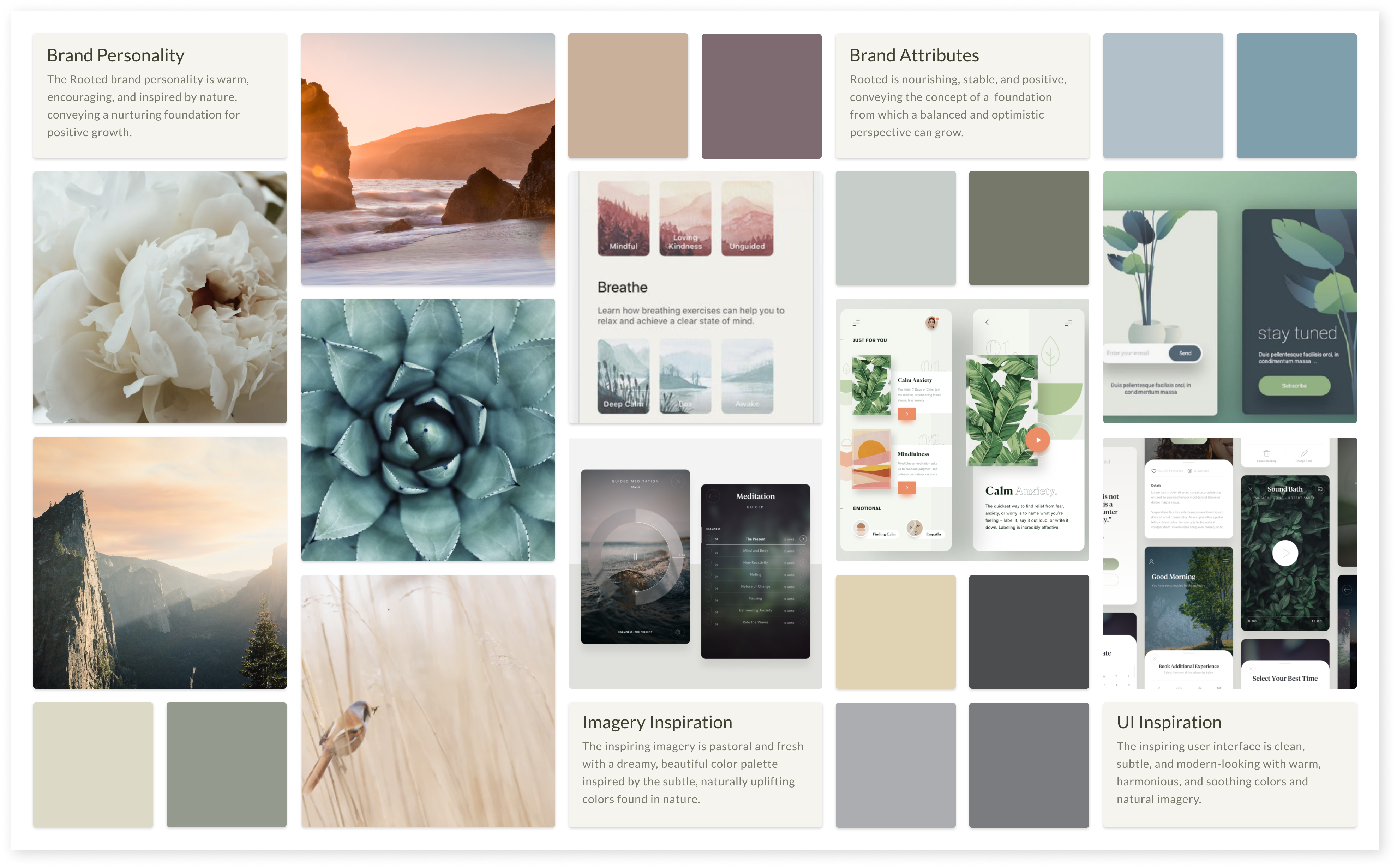
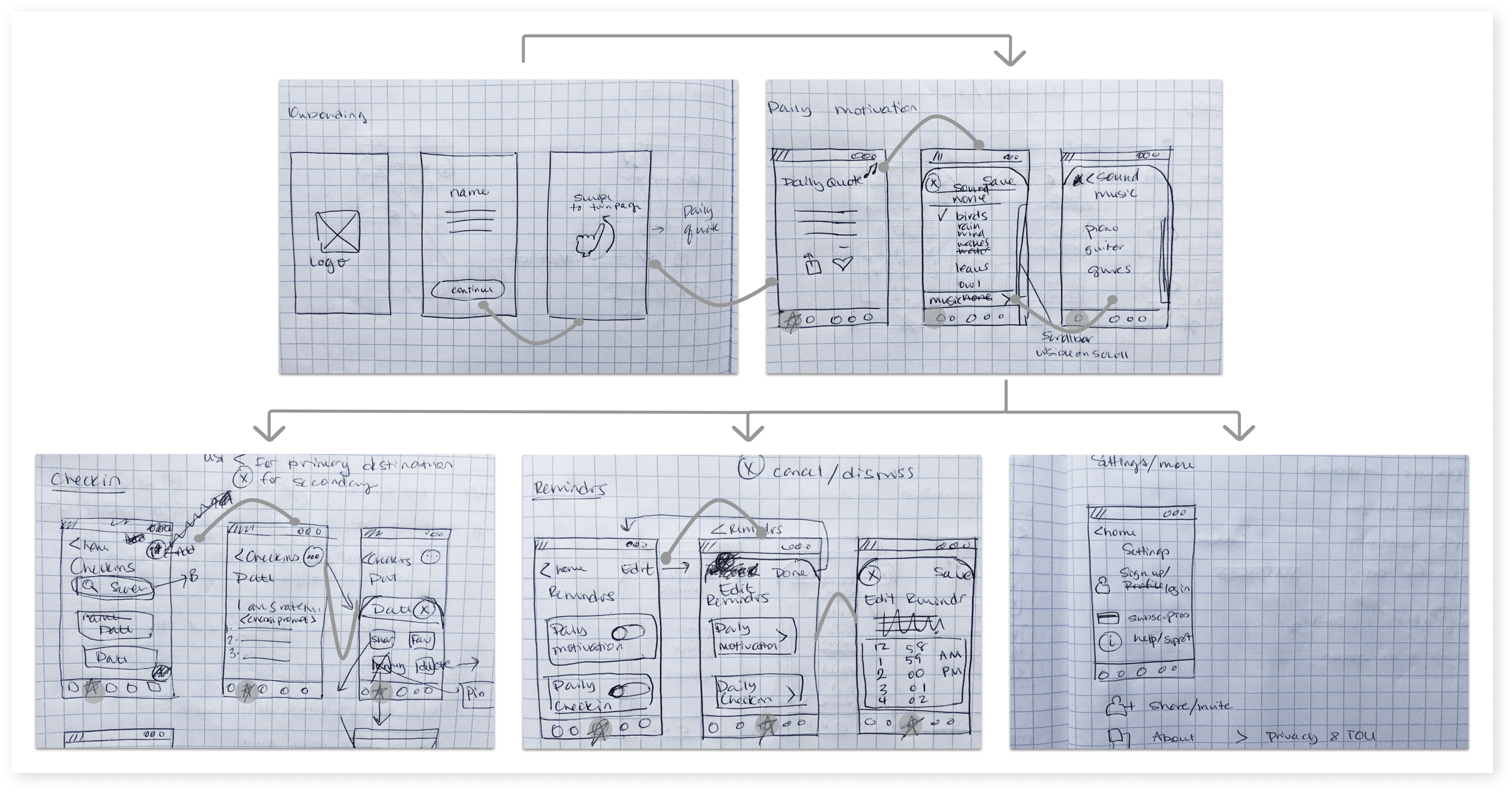
I designed a collage of imagery and design inspirations to reflect the brand’s visual aesthetics. This moodboard would later inform the style guide and UI design. The brand uses pastoral imagery and a color palette inspired by nature’s subtle, uplifting colors. I created sketches to translate the red route user flows into screens and to demonstrate how the interface would transfer to a mobile platform.
Style Guide
I created a lightweight brand platform and representative style guide that would allow Alex and Steve to feel grounded, nurtured, and uplifted. The style guide includes a logo, color palette, typography, layout, iconography, interface components, photography, and imagery.
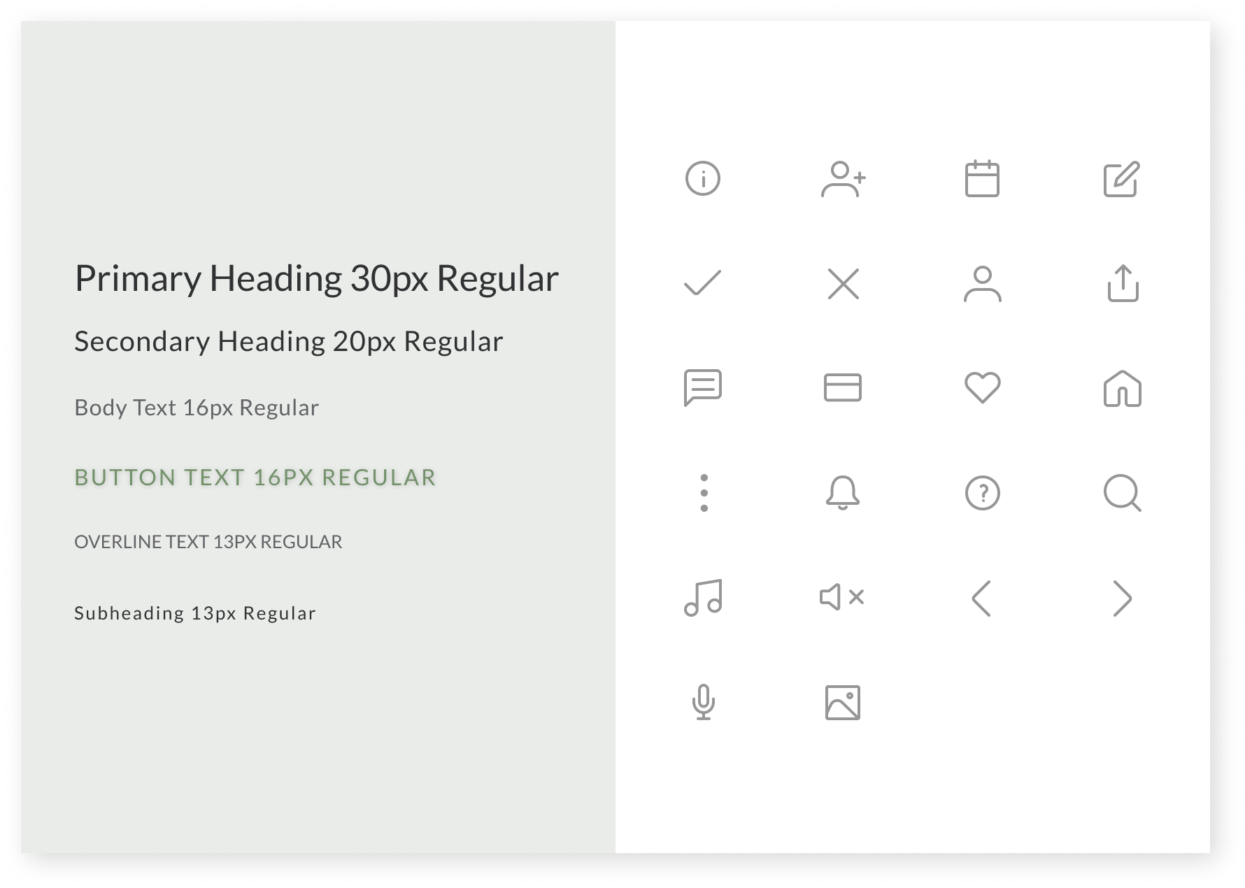
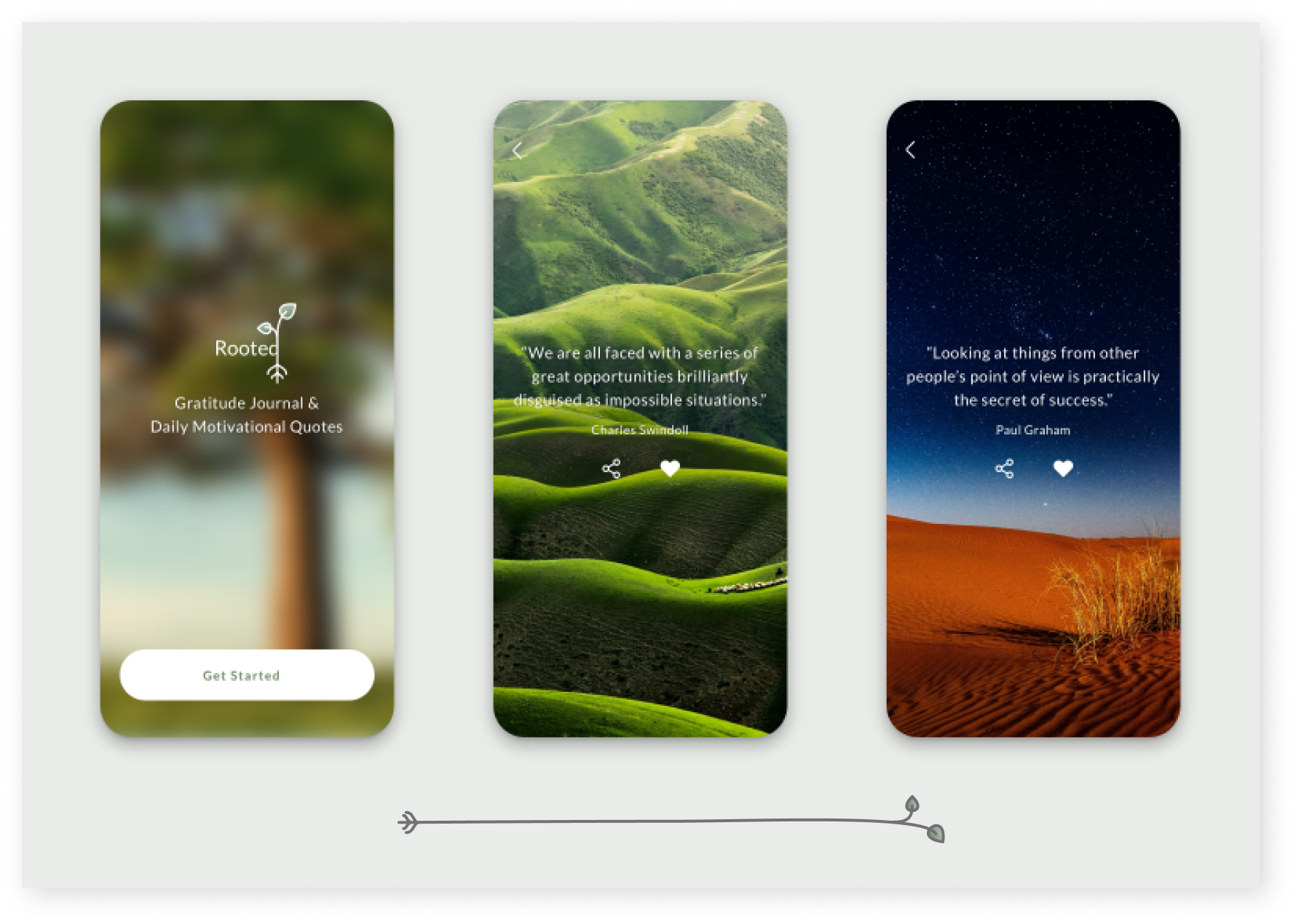
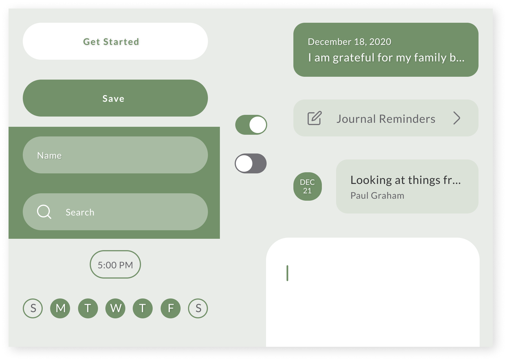
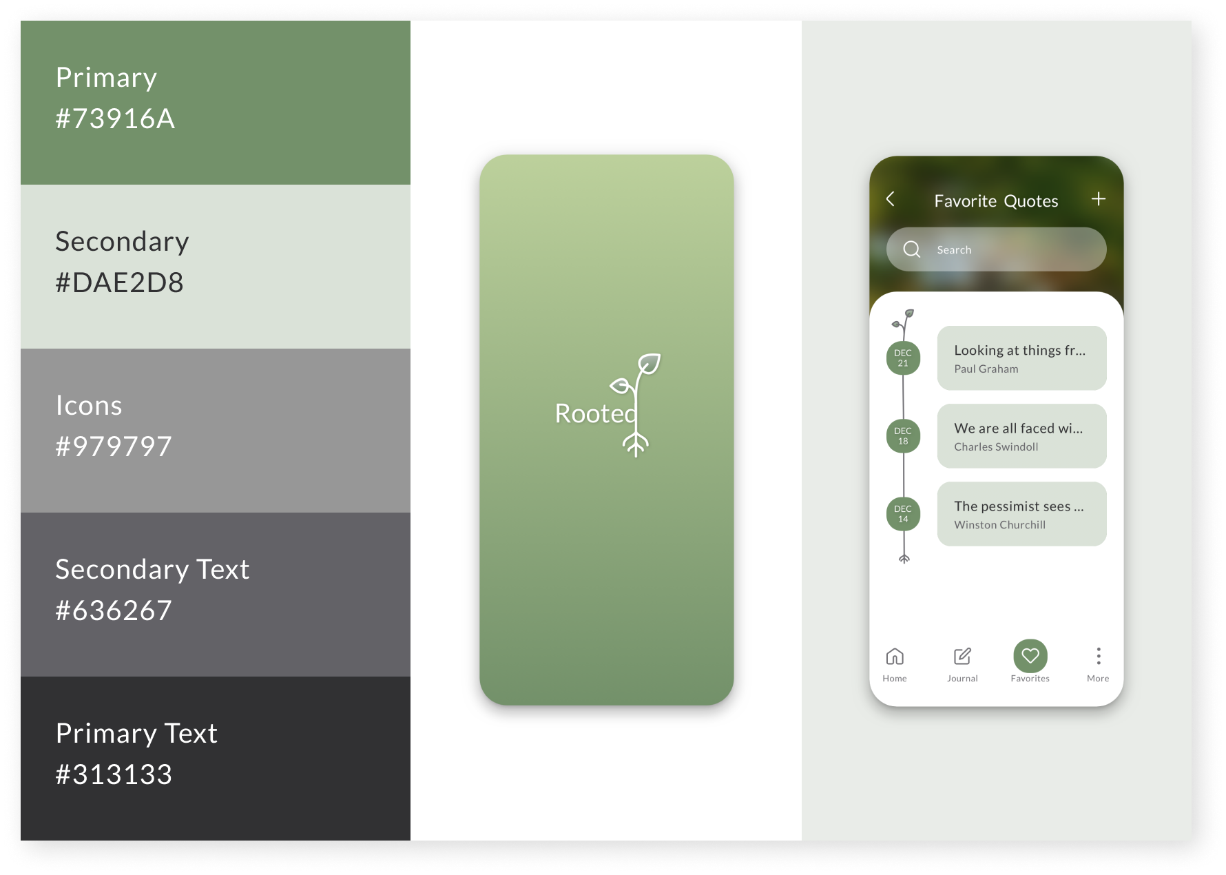
Style guide
Validate
To test my solution, I created a prototype realistic enough to get genuine reactions to the final product.
Usability Testing (Round 1)
I conducted usability testing to assess whether the UI design would enable Alex and Steve to accomplish core tasks without confusion. Five participants completed four task scenarios on a moderated remote Zoom meeting using an InVision prototype of the Rooted app.
Usability Testing (Round 2)
I conducted a second round of usability testing to assess whether the revised UI design reduced the time Alex and Steve would need to complete core tasks. Five new participants completed four task scenarios on a moderated remote Zoom meeting using a revised InVision prototype of the Rooted app.
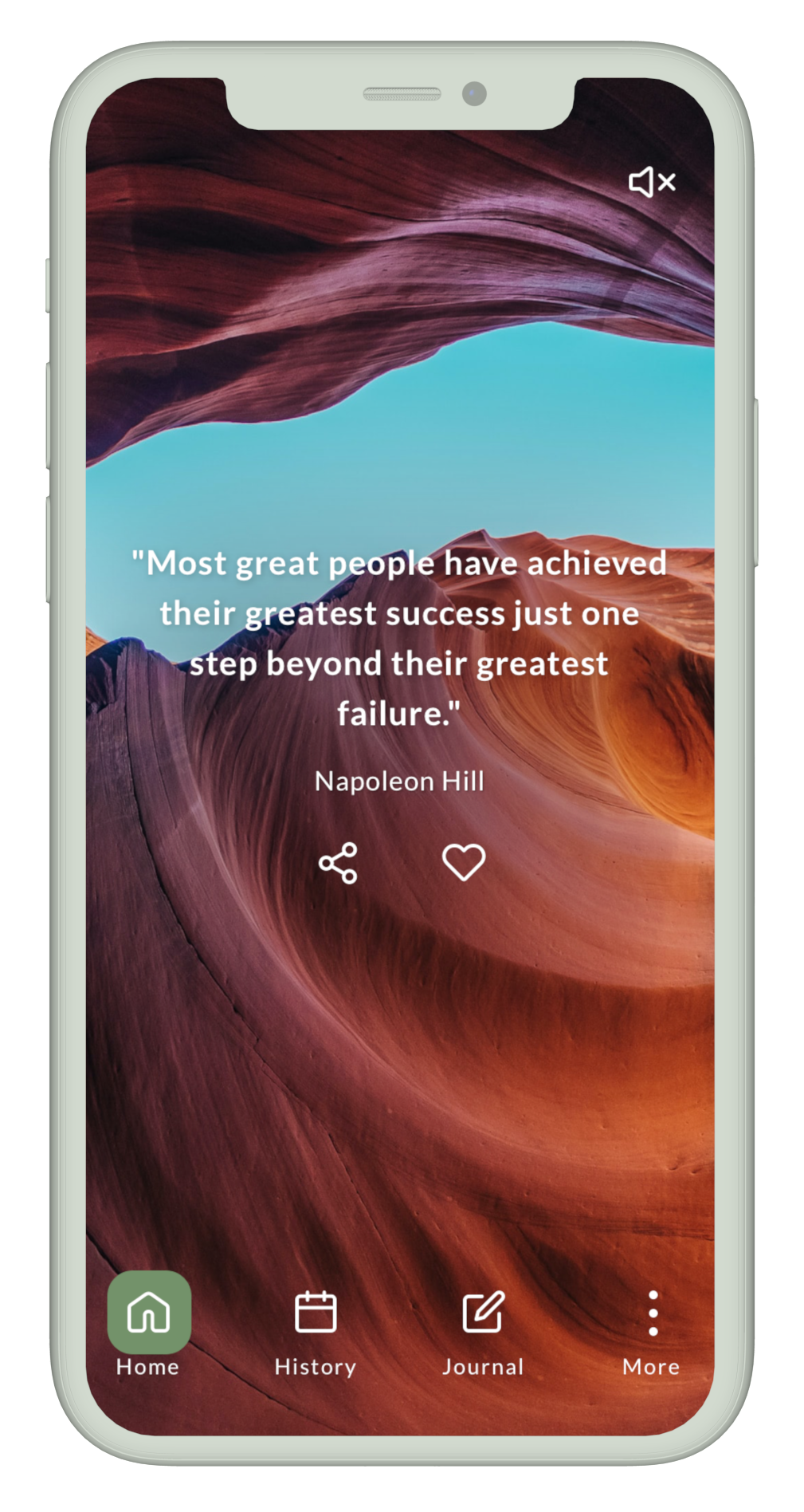
Goal 1: Improve Accessibility
Participants appreciated the minimalist design aesthetic, accomplished core tasks on first encounter, and performed tasks quickly once they understood the design. However, the text was difficult to read.
Accessibility
To improve accessibility, I increased the color contrast between the text and the background image.
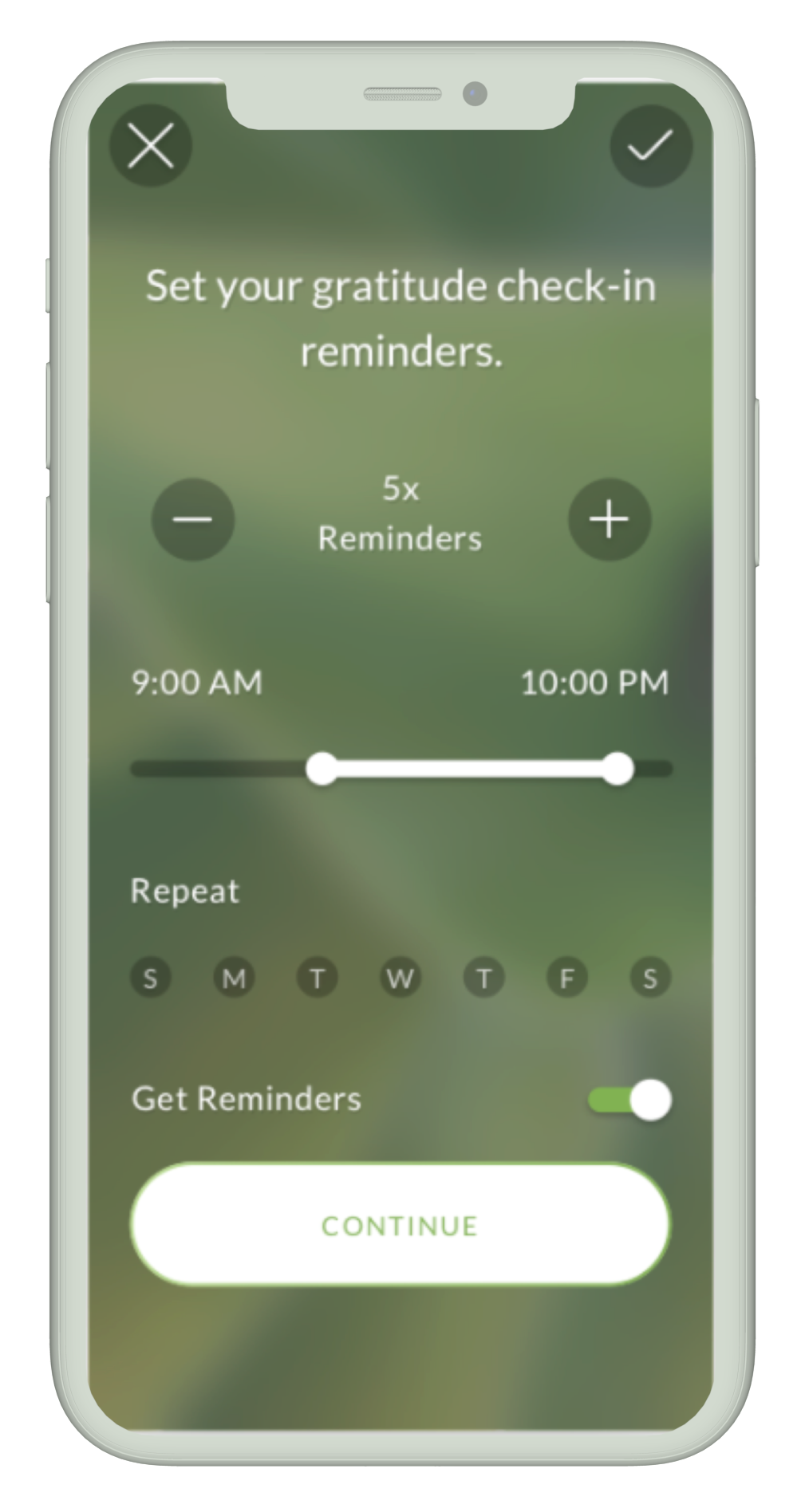
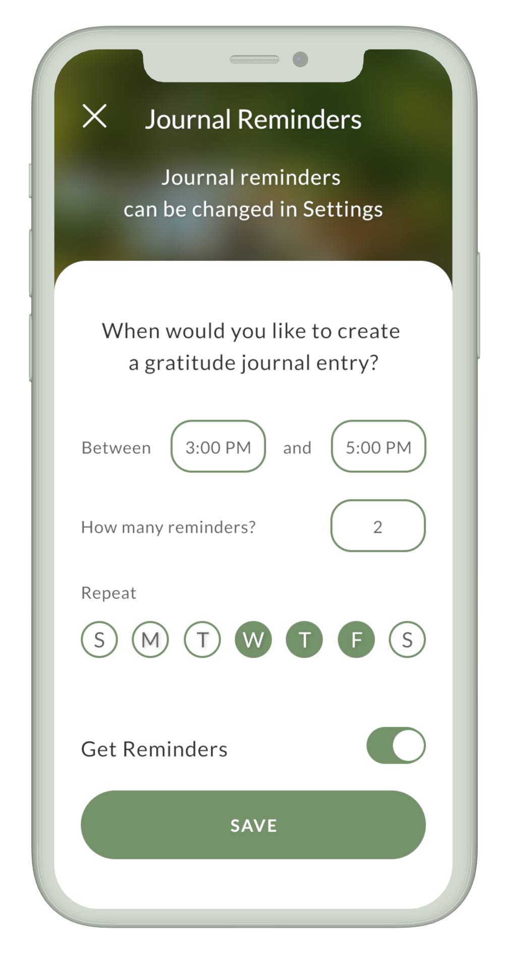
User Control
To help Alex and Steve feel in control of their experience, I designed the Reminders screens to control the frequency, time window, and day of the week for receiving reminders.
Goal 2: Improve Discoverability
Participants could quickly and easily accomplish core tasks. However, they spent more time locating primary destination screens than completing other task scenarios.
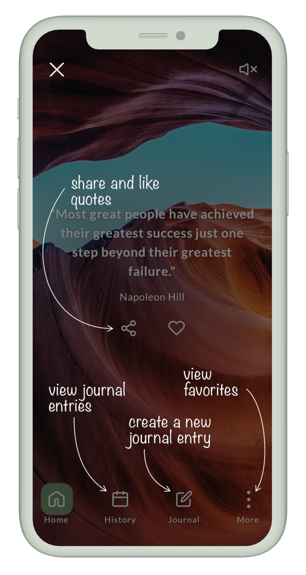
Discoverability
To increase the discoverability of the Reminders and Favorite Quotes screens, I included instructions on coach-marked onboarding screens.
User Control & Freedom
Coach-marked onboarding screens were a higher priority usability issue than expected. They increased frustration and decision-making time due to information overload and an unclear exit mechanism.
Goal 3: Reduce Interaction Cost
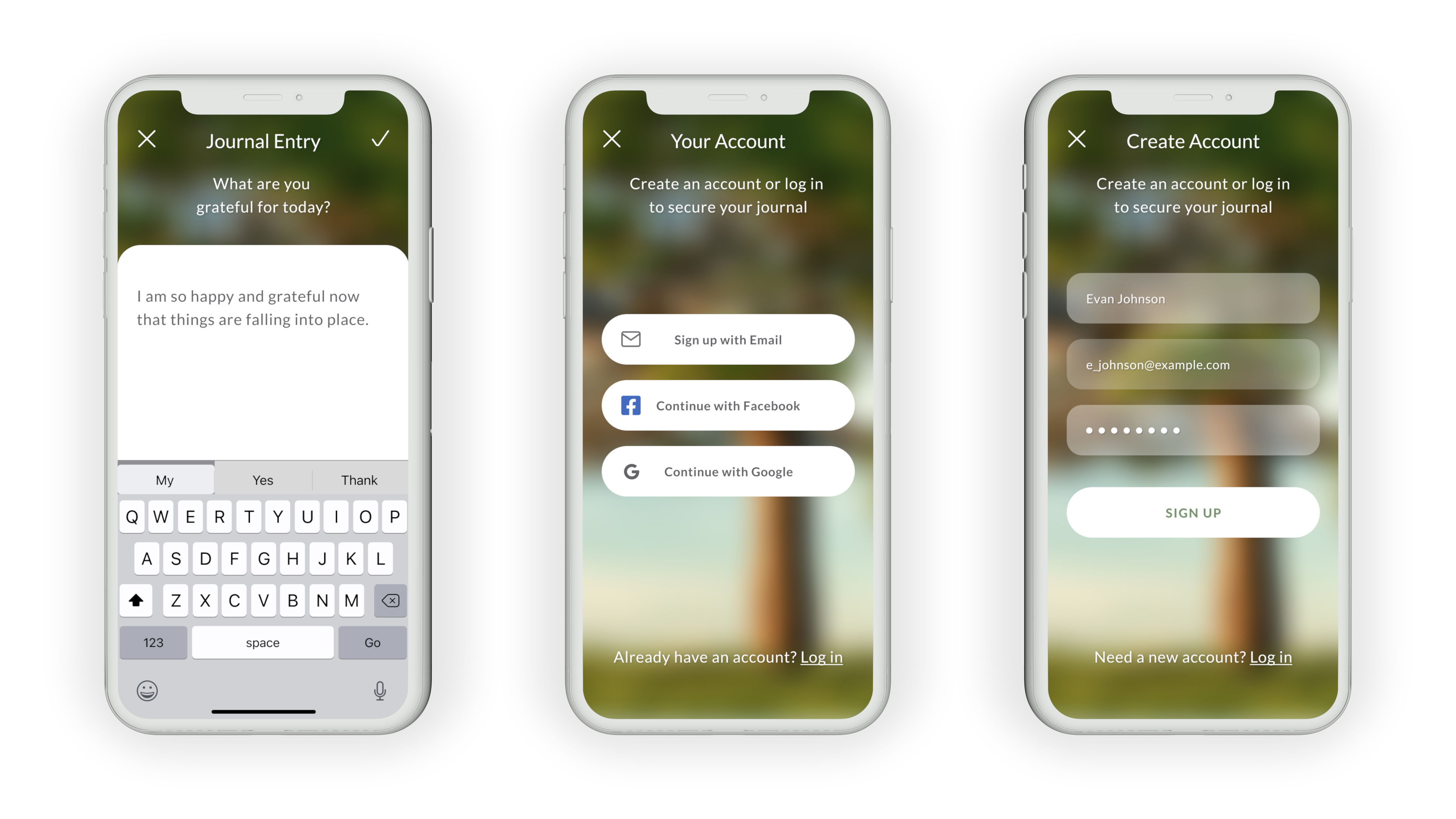
To reduce the likelihood of abandonment, I removed the sign-up and login screens from onboarding, allowing users to quickly and easily reach their goals. Alex and Steve can sign up or log in when they are ready to save a journal entry.
Retrospective
Rooted is not a live product, so no behavioral metrics are available to assess whether I designed a successful product. If I had live data to explore, I would measure the product’s success by quantifying the user’s happiness, engagement, adoption, retention, and task success. Given that this design exploration produced a minimum viable product, future design iterations could validate unexplored user stories.
Key Insights
- Follow accessibility and discoverability principles early in the design process.
- An uncluttered design, free of irrelevant information, should maintain essential cues to achieve goals without confusion.
- Improve the discoverability of primary destination screens to help users accomplish their goals without an extended process.