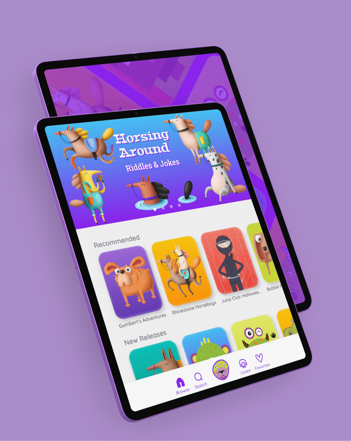
StorySuite
- Year: 2021
- Role: UI/UX Designer
- Tools: Sketch, InVision
As the sole UX Designer and Researcher for this project, I conducted a 5-day modified Google Ventures design sprint to help StorySuite improve the user experience for their digital children’s library.
Overview
Background
StorySuite is a new startup where authors and illustrators publish children’s stories. Parents are frustrated by how challenging and time-consuming it is to find stories to read to their young children.
Project Goal and Solution
The design challenge was to design a possible solution to help StorySuite increase engagement and ease of use. The final design must be tablet-based to optimize reading text and viewing illustrations. So, I conducted a modified Google Ventures design sprint to design an engaging, personalized, and straightforward tablet-based solution to help parents find great stories to read to their young children.
Research Methods
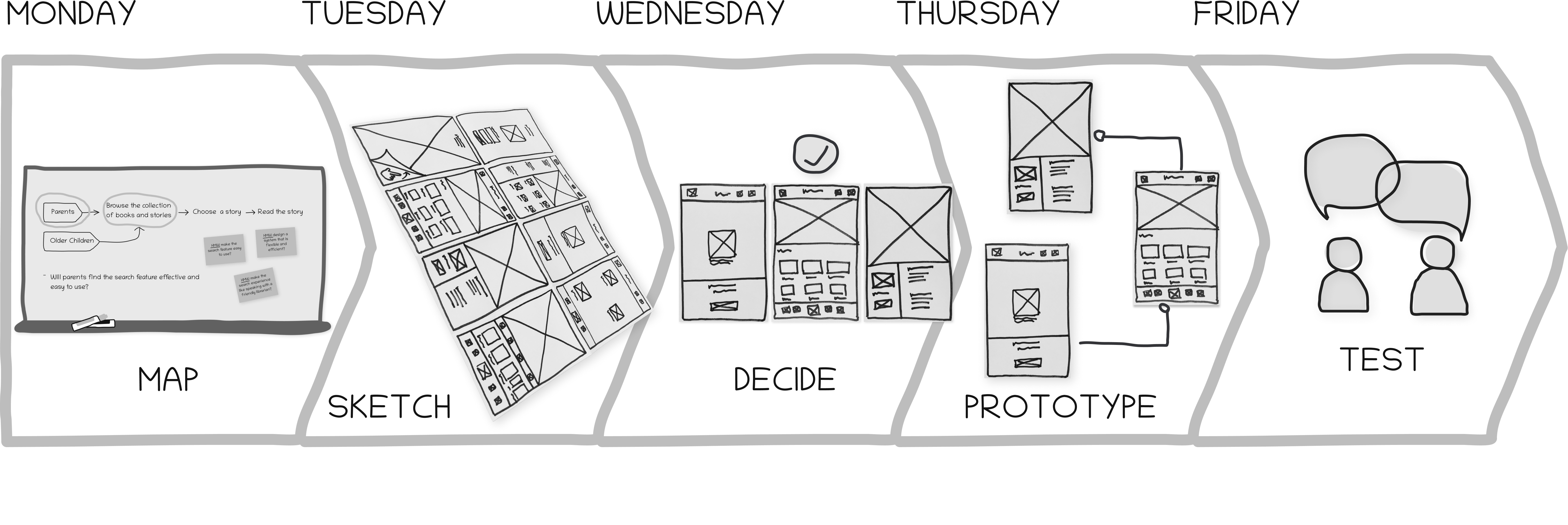
I conducted a Google Ventures design sprint to come up with a possible solution quickly. This particular design sprint was modified to account for the fact that I worked alone. I conducted this design sprint over five days; each day had its own specific set of tasks.
Monday: Map
Long-Term Goals & Sprint Questions
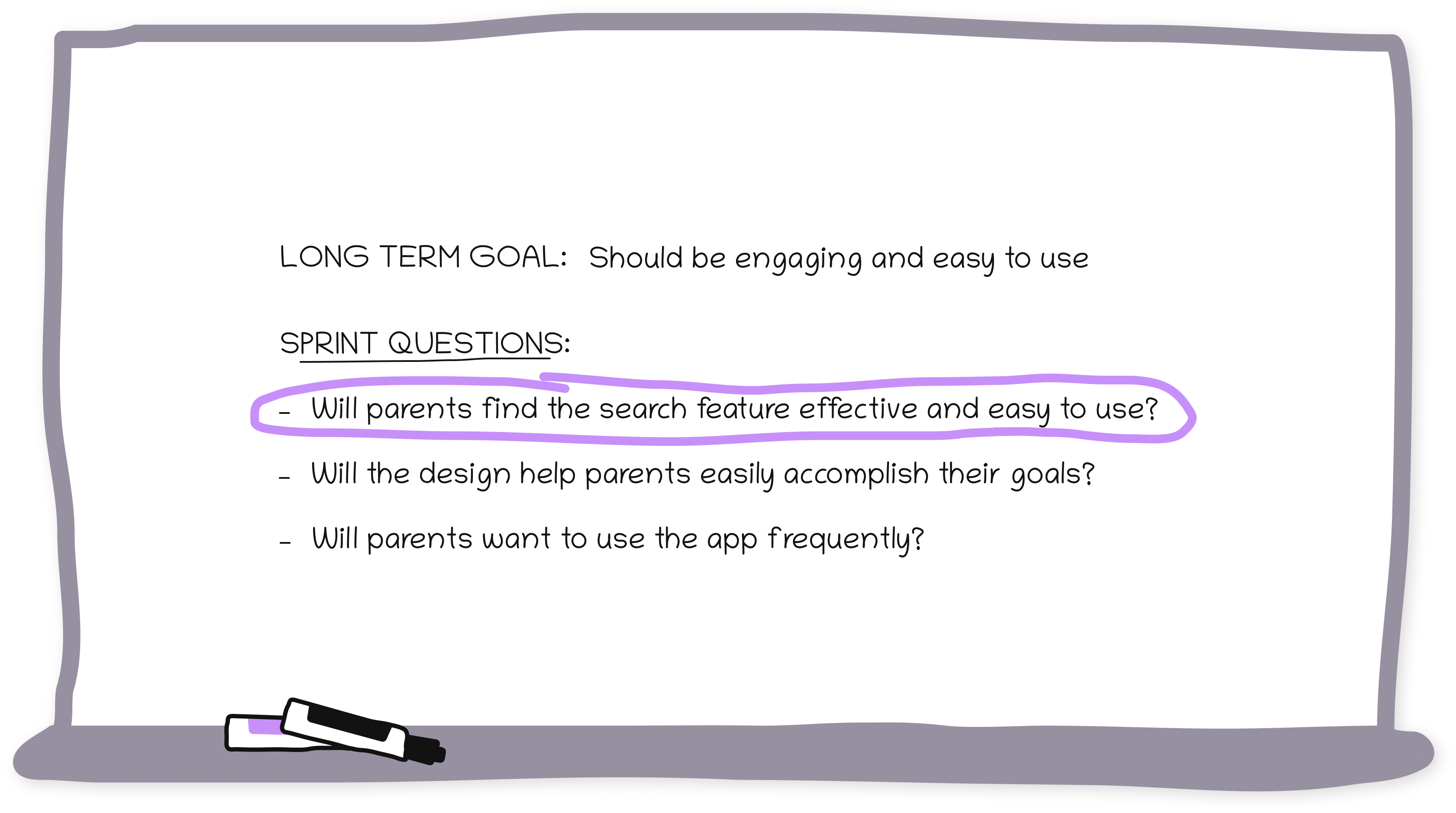
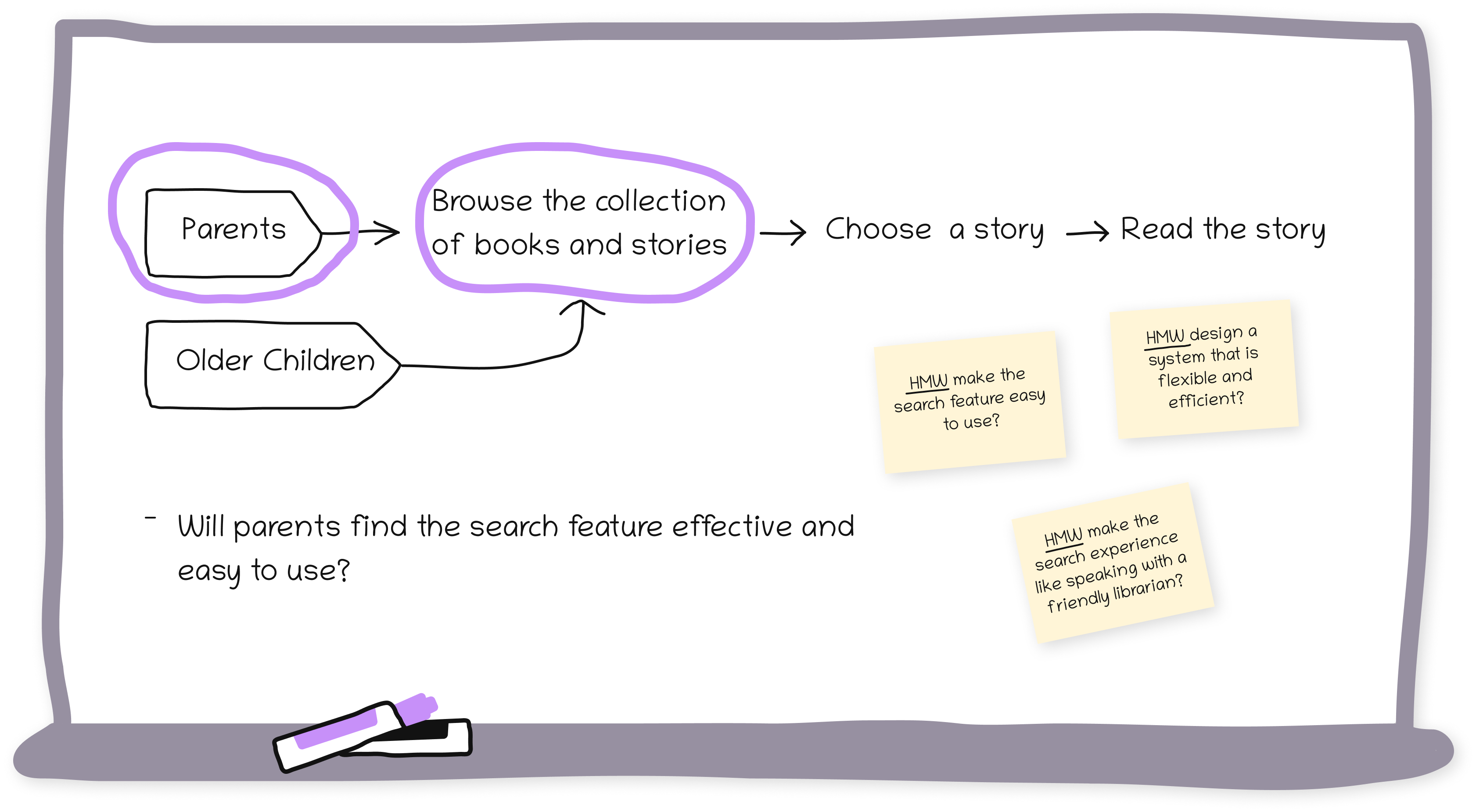
To prioritize and plan for the week ahead, I identified the long-term goal and underlying sprint questions to address. The long-term goal reflects the startup’s objective to keep ease of use high for parents, and the sprint questions reflect the assumptions and obstacles that would guide solutions and decisions throughout the week.
How Might We Questions
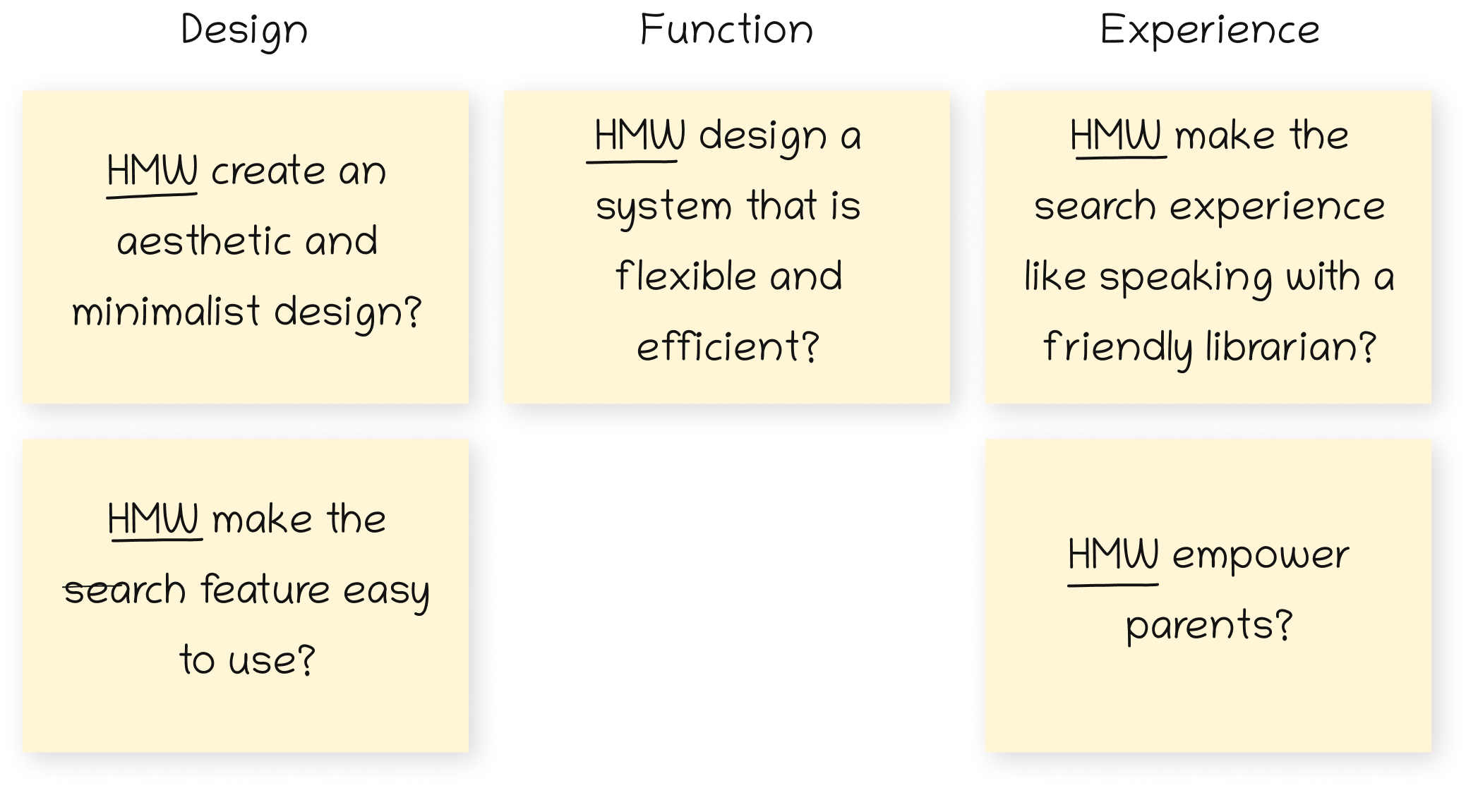
To define and articulate the problems that need an innovative solution, I generated a list of How Might We (HMW) questions. Themes emerged: my collection of HMW notes described app design, functionality, or user experience.
Target & Map
To visually display the journey from the problem to the solution, I created a map with a user-centered list of key actors on the left and the steps they must take to achieve the end goal on the right. I added the target-centered sprint question and the HMW questions emphasizing ease of use to the map. The target, or the most important actor in this design sprint, is the parent. Parents would be the focus of the sketches, prototypes, and tests that follow. The critical moment a parent would experience is initiating the search for a story.
To reduce the likelihood of app abandonment, I simplified the route between the parent and their goal by removing barriers to taking their desired action.
Tuesday: Sketch
Crazy 8s
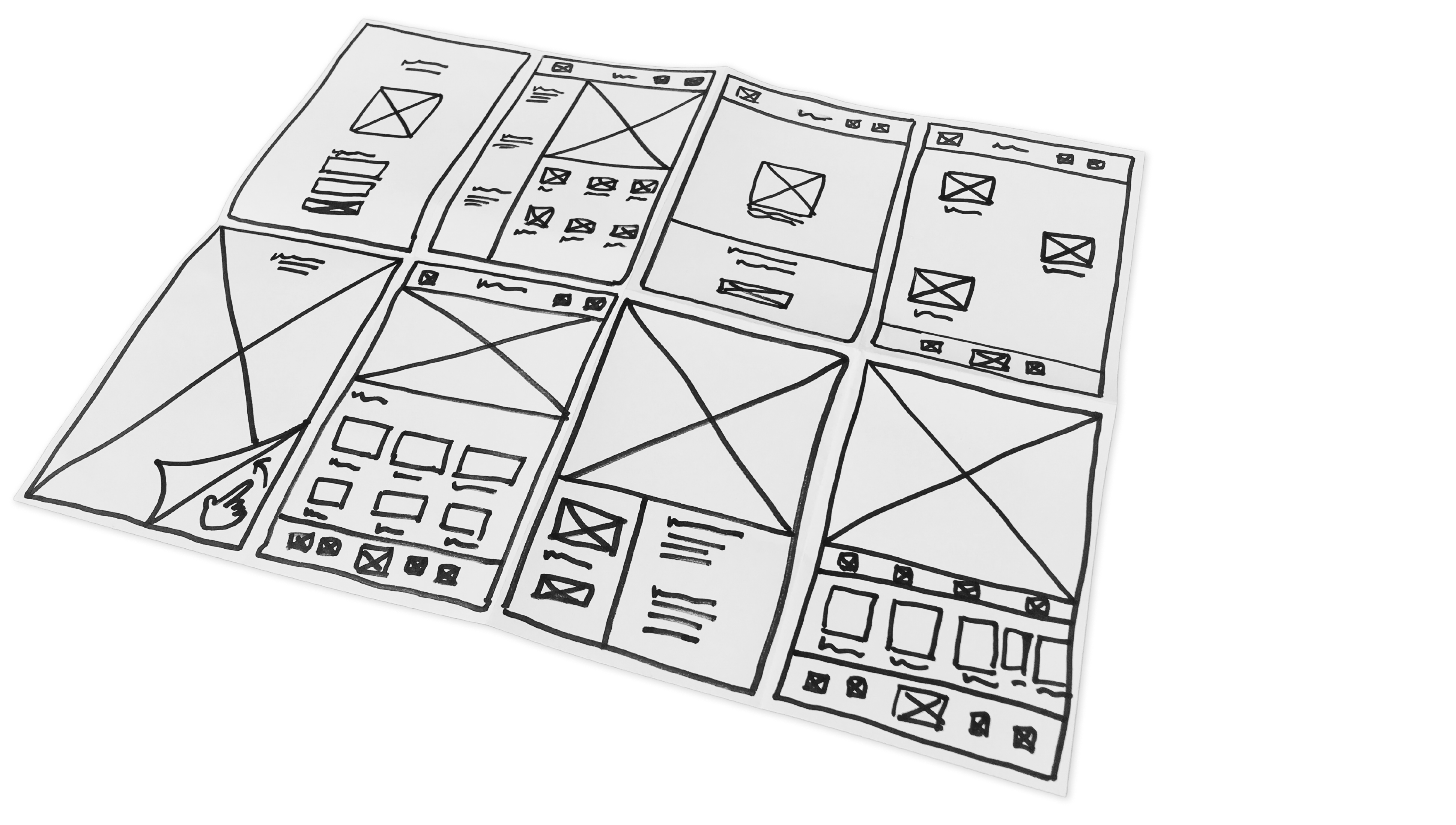
I designed an experience similar to visiting a local children’s library. This solution begins with seeing a welcoming display of featured stories, then creating a profile and declaring their interests before viewing the entire catalog. I explored eight variations of this idea with a Crazy 8s rapid sketching exercise.
Lightning Demos
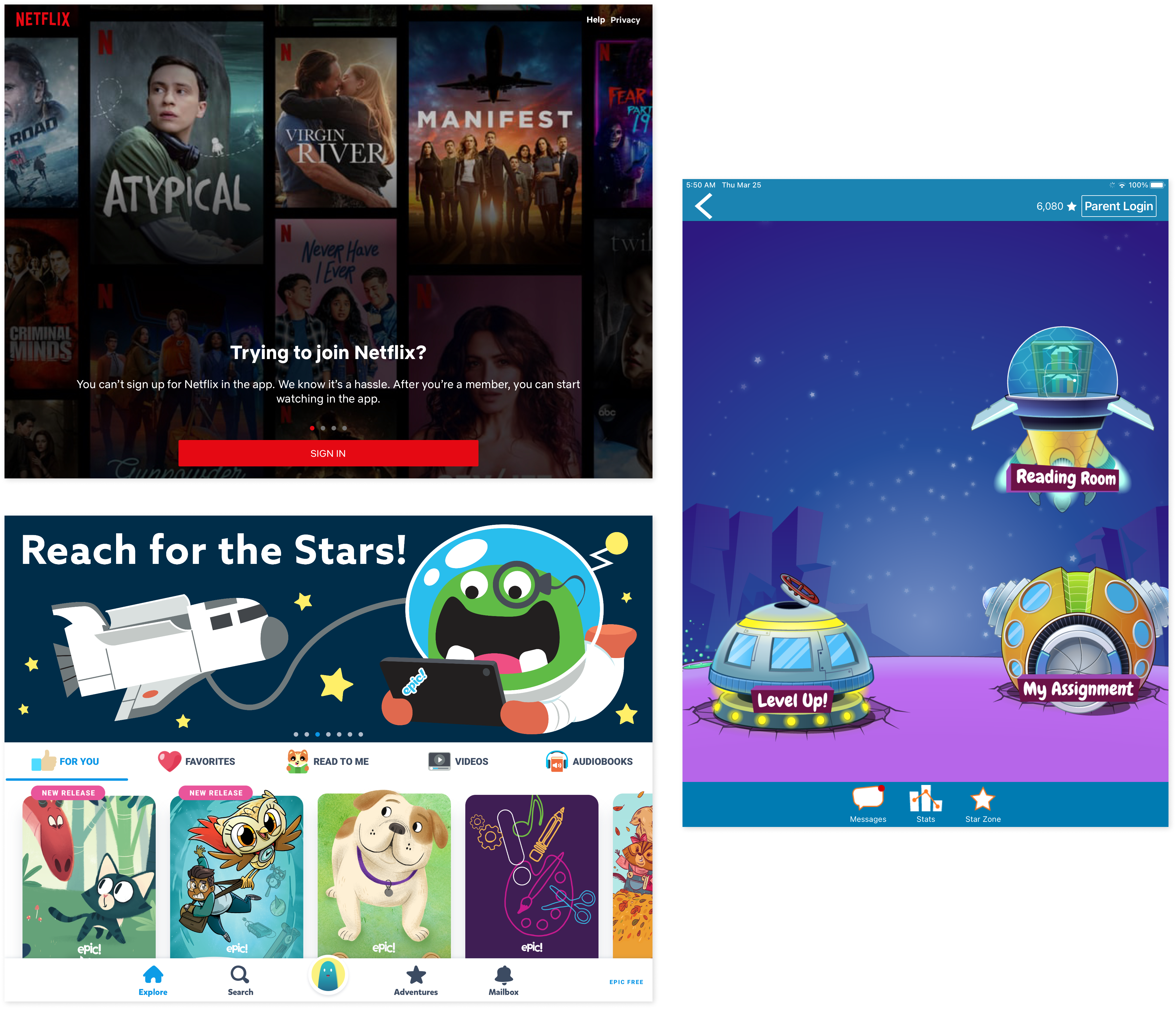
For inspiring design solutions, I reviewed the Epic and Raz-Kids digital library apps and the Netflix app. I thought Epic and Raz-Kids would provide inspiring kid-friendly interface design solutions for displaying the library catalog, and I thought Netflix would provide anticipatory design solutions.
Solution Sketch
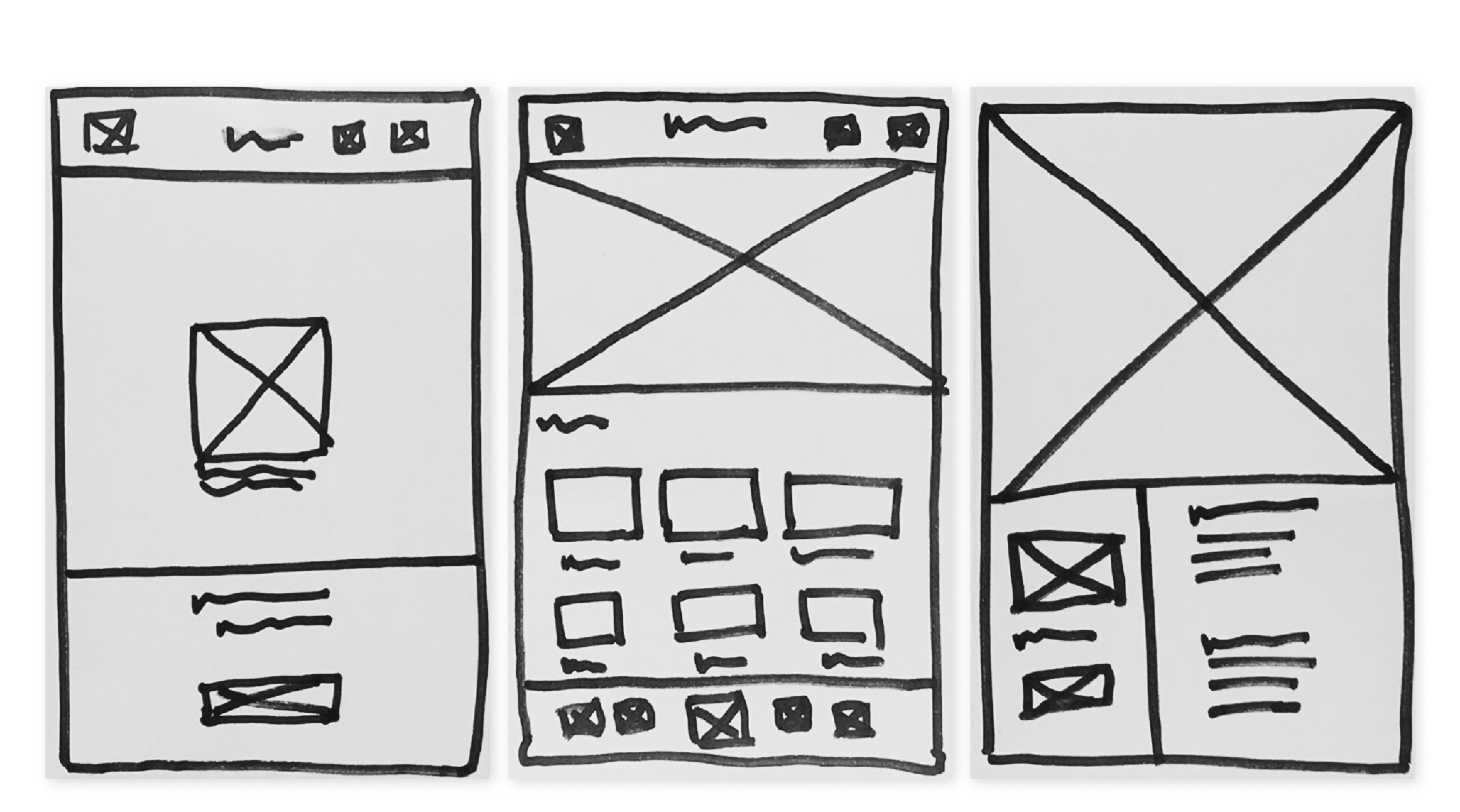
My three-frame storyboard shows a concept of what parents see as they interact with the app. In the first frame, the parent creates a profile for their child; in the second frame, they browse the catalog; and in the third frame, they read the story.
Thursday: Prototype
Rapid Prototyping
To test my solution, I created a prototype realistic enough to get parents’ genuine reactions to the final product.
Friday: Test
Usability Testing
I conducted usability testing to assess whether the initial prototype enabled parents to find interesting stories to read to their children easily. Five mothers of preschool or elementary school-aged children completed task scenarios on a moderated remote Zoom meeting using an InVision prototype of the StorySuite app.
Observations
Parents found the interface design straightforward, familiar, and easy to use. Many had recently used audiobooks and library apps to find and read books during quarantine, so the interface design solution felt current and appropriate. Parents quickly adopted the familiar design because it did not require a high degree of behavior change.
Wednesday: Decide
Storyboard
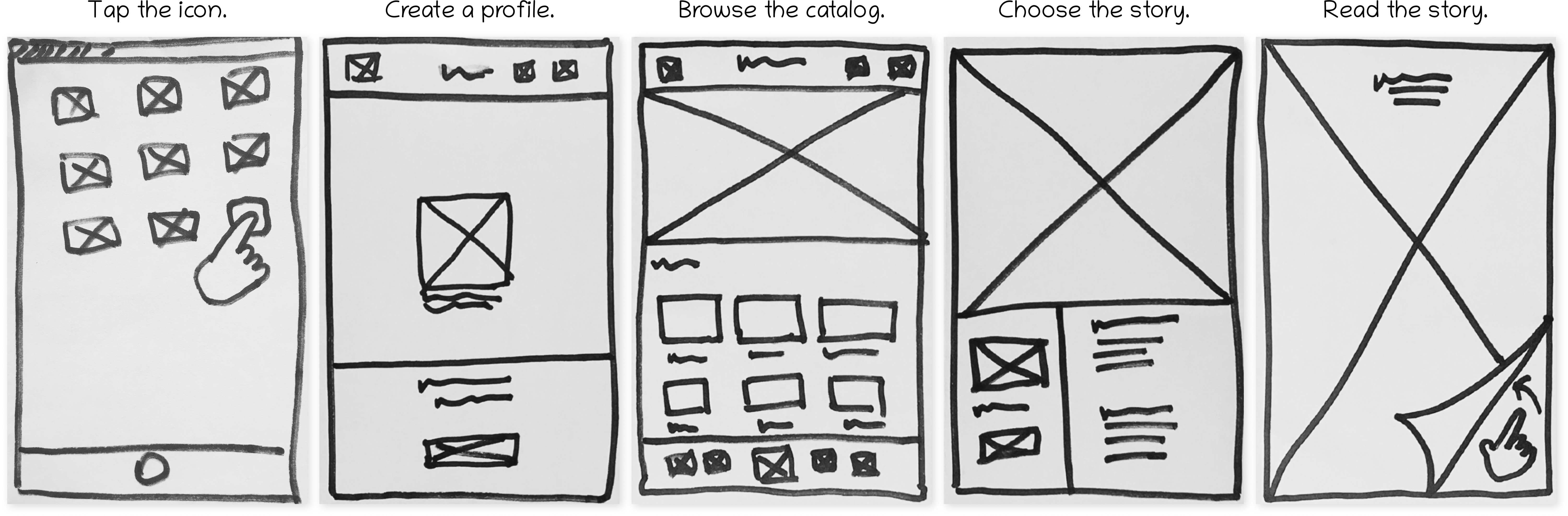
I created a five-frame storyboard that starts when the parent taps on the app icon for the first time and ends with them reading the story.
Design Decisions
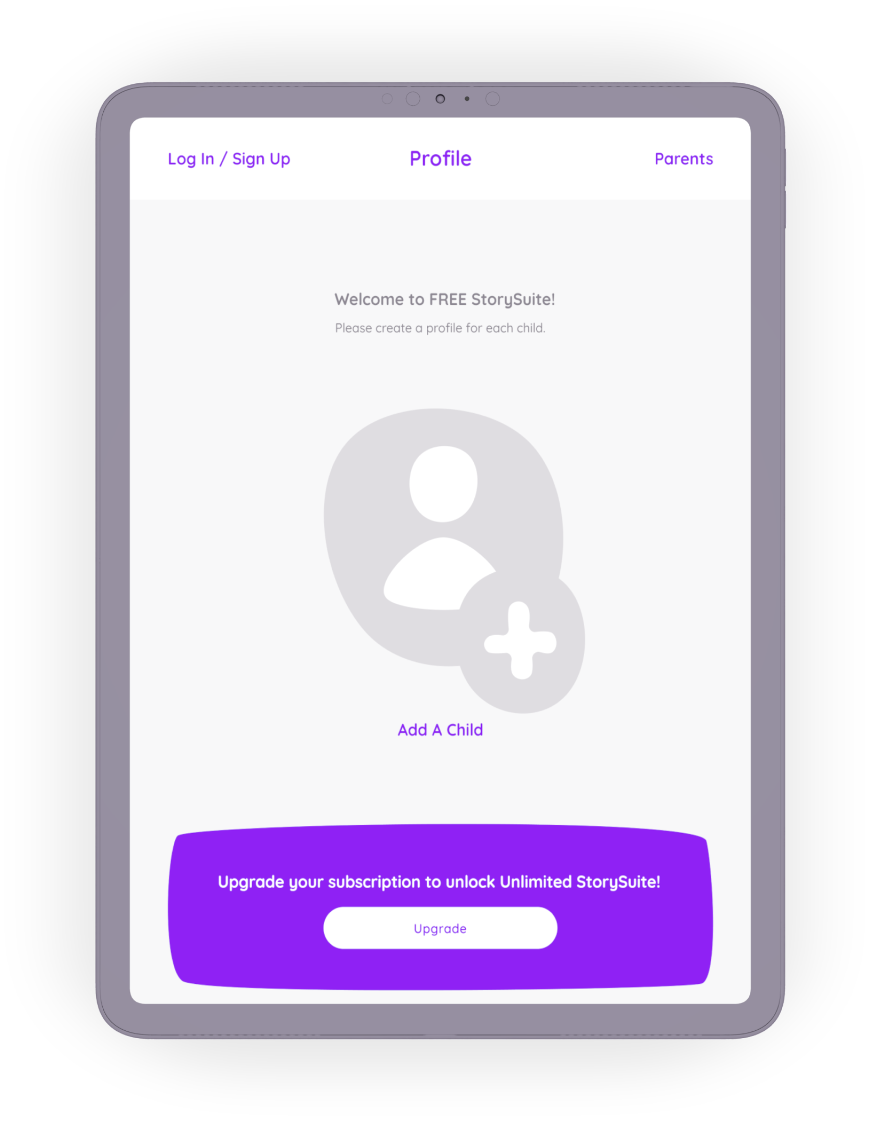
Creating a profile is the most prominent call to action. I designed the onboarding flow to be as simple as possible, knowing that having an account for each child would improve the parent’s experience.
I used the “freemium” model, which lets parents use the app without financial obligation until motivated to select a paid tier. Once the app is a valuable part of their routine, price sensitivity decreases.
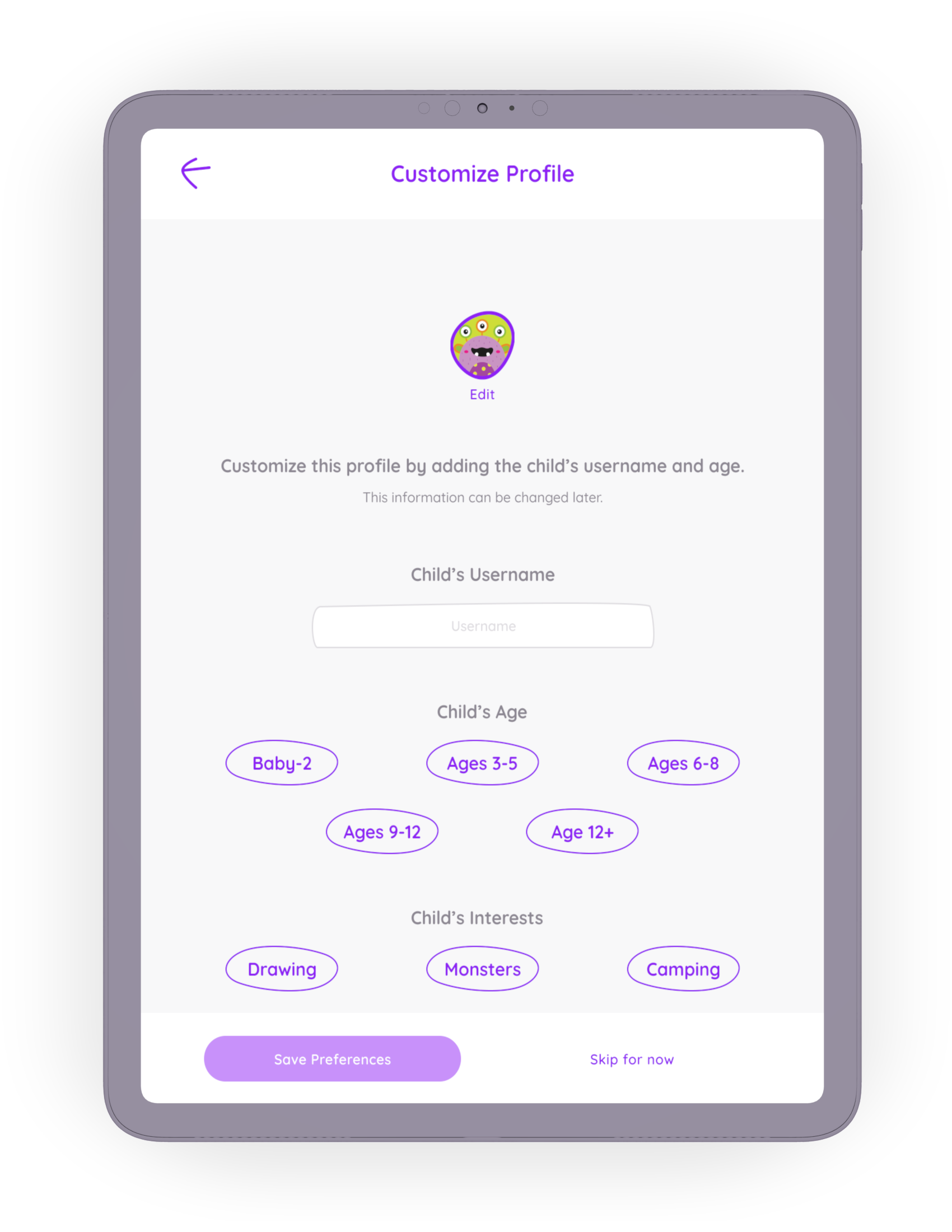
Customization is required, but I made it optional during the onboarding user flow to reduce the number of steps between the parent and the story.
Identifying preferences will help the app deliver accurate and personalized suggestions, making each use more valuable and encouraging frequent use.
Design Decisions
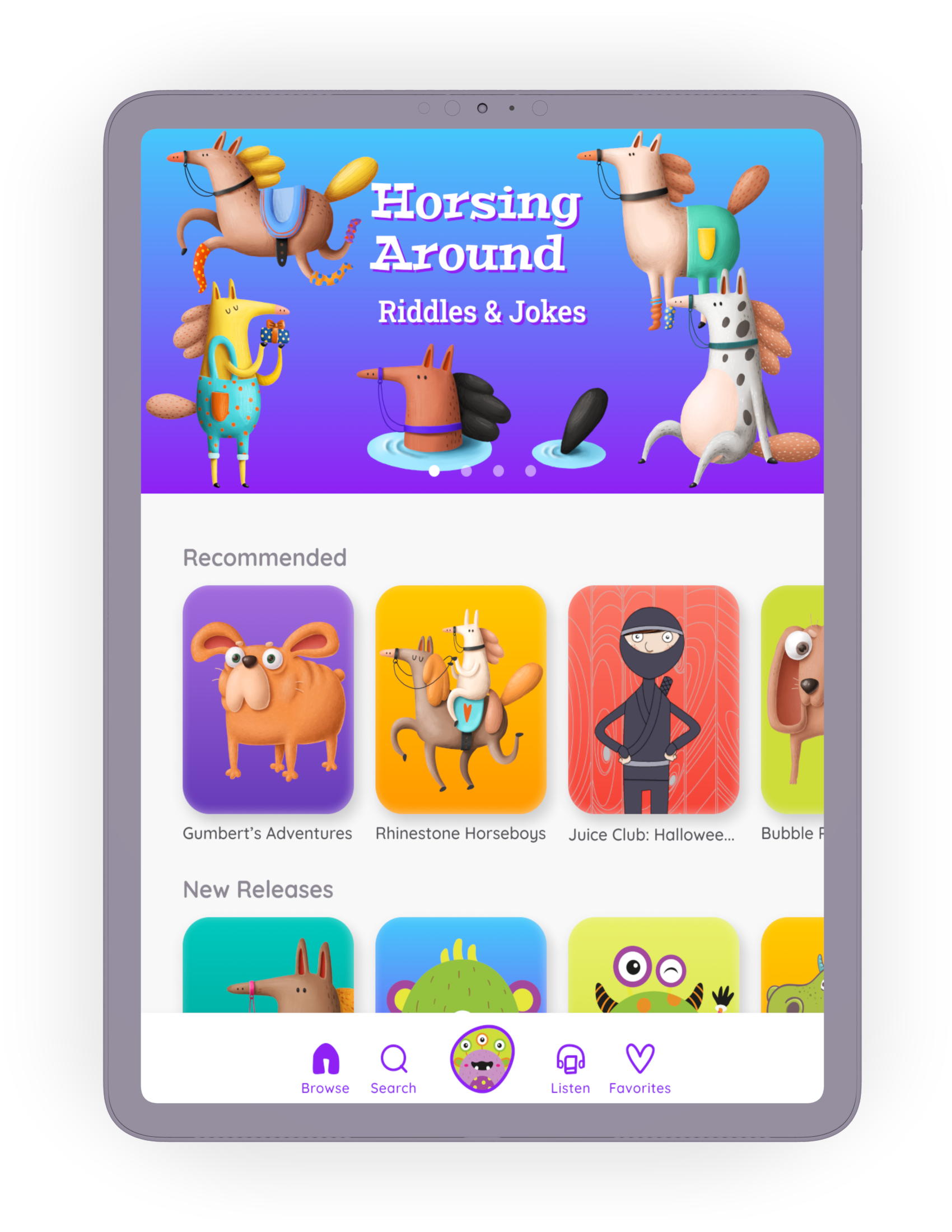
The browse screen displays results related to the child’s general interests. Behavioral data is stored with each use to improve personalization on this screen. I used infinite horizontal scrolling to let parents view more results in each category.
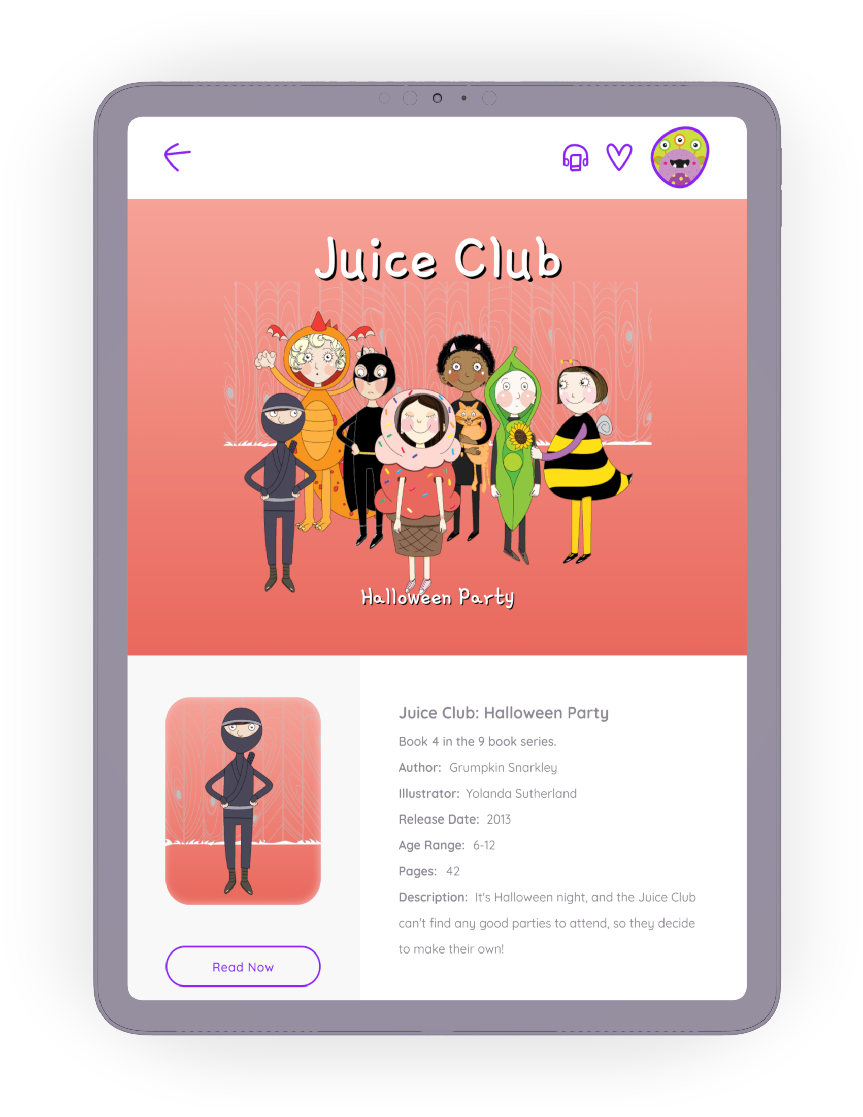
Parents can view story details and then read the story from this screen. People who prefer the audio version can tap the audiobook icon on the top navigation bar.
* Juice Club illustrations by Yolanda Sutherland.
Retrospective
Metrics & Limitations
StorySuite is not a live product, so no behavioral metrics are available to assess whether I designed a successful product. If I had live data to explore, I would measure the product’s success by quantifying the user’s happiness, engagement, adoption, retention, and task success.
Key Insights
- Designs that do not require a high degree of behavior change are more easily adopted.
- Reduce the number of steps between users and their goals.
- Make the required steps as straightforward as possible.
- Each use makes the app a more valuable addition to the user’s routine and encourages frequent use.
Future Directions
- Social Rewards: Let parents view and share reviews with other parents who use the StorySuite app.
- Progress Tracking: Let young readers set goals and track their progress.
- Gamification: Use points and badges to acknowledge young readers’ achievements.